Flowly
With the intention to provide financial agency to small enterprises, Flowly allows small businesses to easily understand the financial health of their business and take actionable steps to improve it. Small business need a solution that unifies clarity, simplicity, and guidance, all in one. My research focused on understanding how different types of small businesses manage finances, the mental models they rely on, and where the current experience breaks down. This grounded the project in real-world constraints while helping identify the information architecture and core features the dashboard needed most.
Project type
Independent
Areas of work
UX Design
Prototyping
Testing
User research
UI Design
User flow
Softwares
Figma
Figma make
Adobe Creative Suite
Procreate
Old Fashion pen & paper
Timeline
5 days
RESEARCH
Exploring the problem space
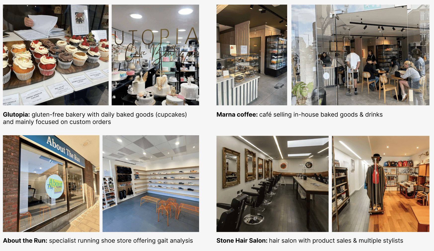
I wanted to help small businesses with problems they actually had, so I went directly to local businesses in my area, and spoke with them to understand their business, what systems are in place, how much financial management they conduct and how.
I wanted to chose a range of business types to understand the difference among small businesses. For example, some businesses deal with simple resale, while others, like bakeries, get parts from suppliers to then sell created products. Other businesses like hair salons, might focus on services rather than products altogether. By talking to a range of businesses, I could understand and cater my solution to more general and wide ranging usage, reaching as many users as possible.
User Interviews
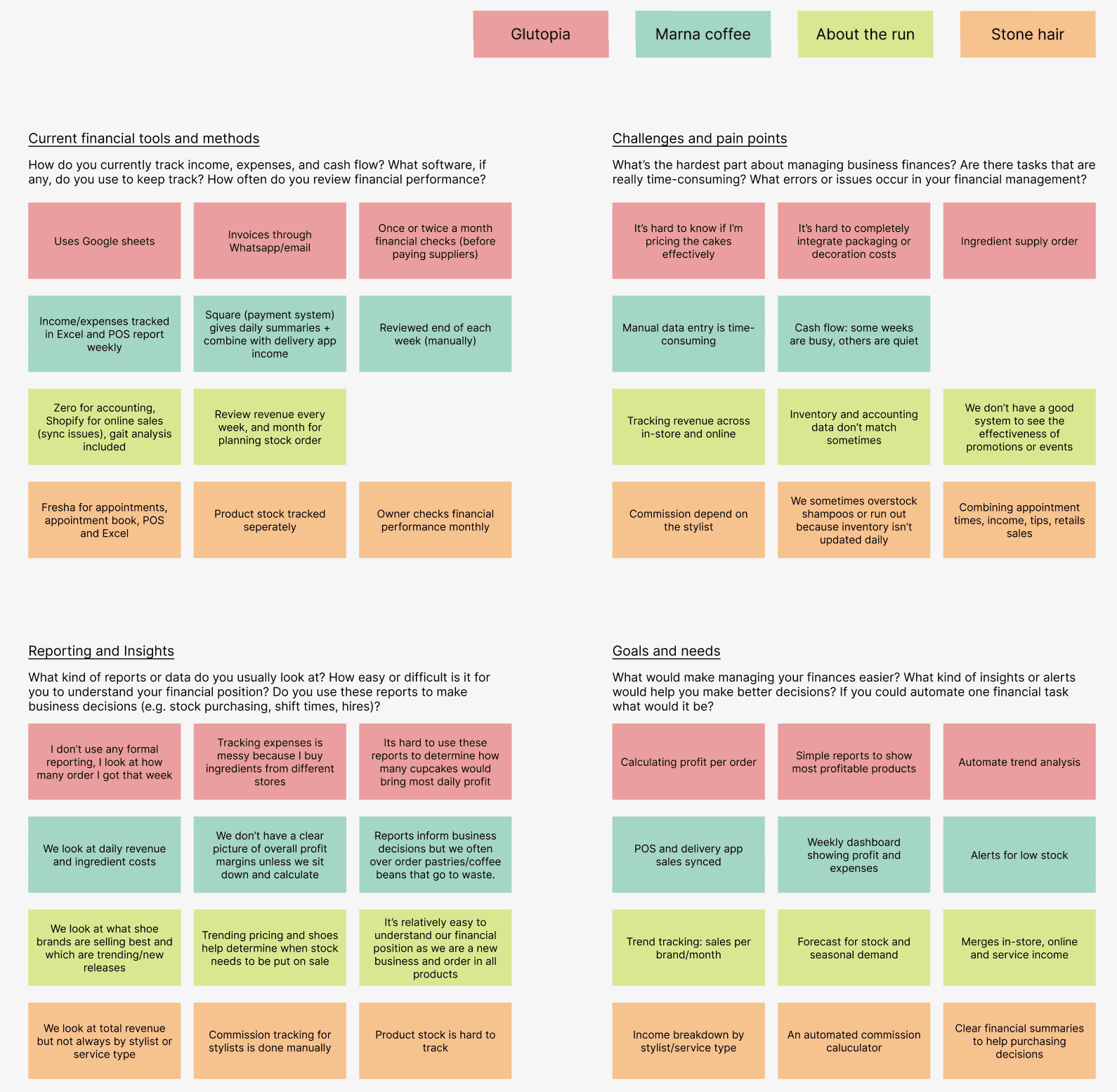
What stood out most from these conversations was the emotional dimension: uncertainty, stress around cash flow, and decision-making driven by guesswork rather than insight. After summarizing these discussions, I uncovered that the main pain points are managing resources, supply, tracking trends, not having a clear summary/idea of financial state, merging online and in-store finances, time-efficiency, lack of visualization. These interviews shaped my core requirements: unify financial data, simplify interpretation, surface insights automatically, and empower owners to act with confidence and control.
DEFINING
The pain points
Data merging & visualisation
Differing platforms show individualised finance information (e.g. Excel, POS, delivery apps, Shopify, manual option, etc.) which is often uncombined or complicated.
Small businesses don’t have simple overall metrics they can look at regarding all combined business transactions.
Small business owners often aren’t as financially literate as accountants or finance departments in bigger businesses
Decision points:
It’s challenging for small business owners to make informed decisions that benefit their financial health from the data they do have.
Overstock or low stock create excess costs and waste.
It’s hard to recognize buying-trends and plan accordingly.
HYPOTHESIS STATEMENT
If small business owners can see and understand their business’s financial health quickly, they can make better informed decisions (e.g. stock, price, quantity) that help their business thrive and increase net revenue.
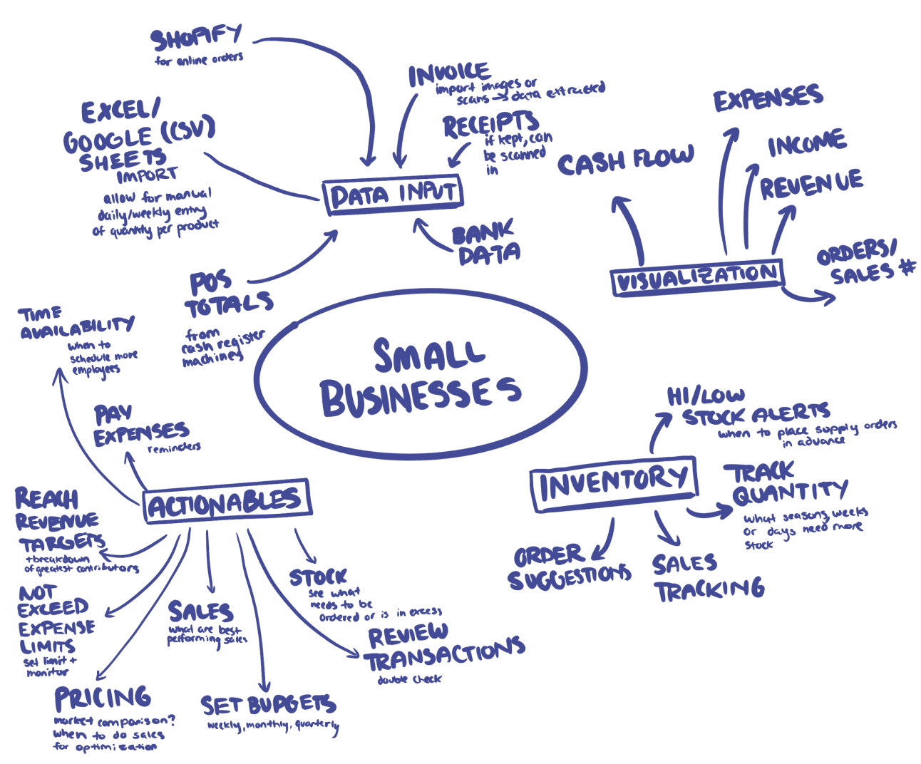
Mindmap
Mapping out the function of a financial management dashboard for a small business and breaking down the complexity of data input, output and actionables.
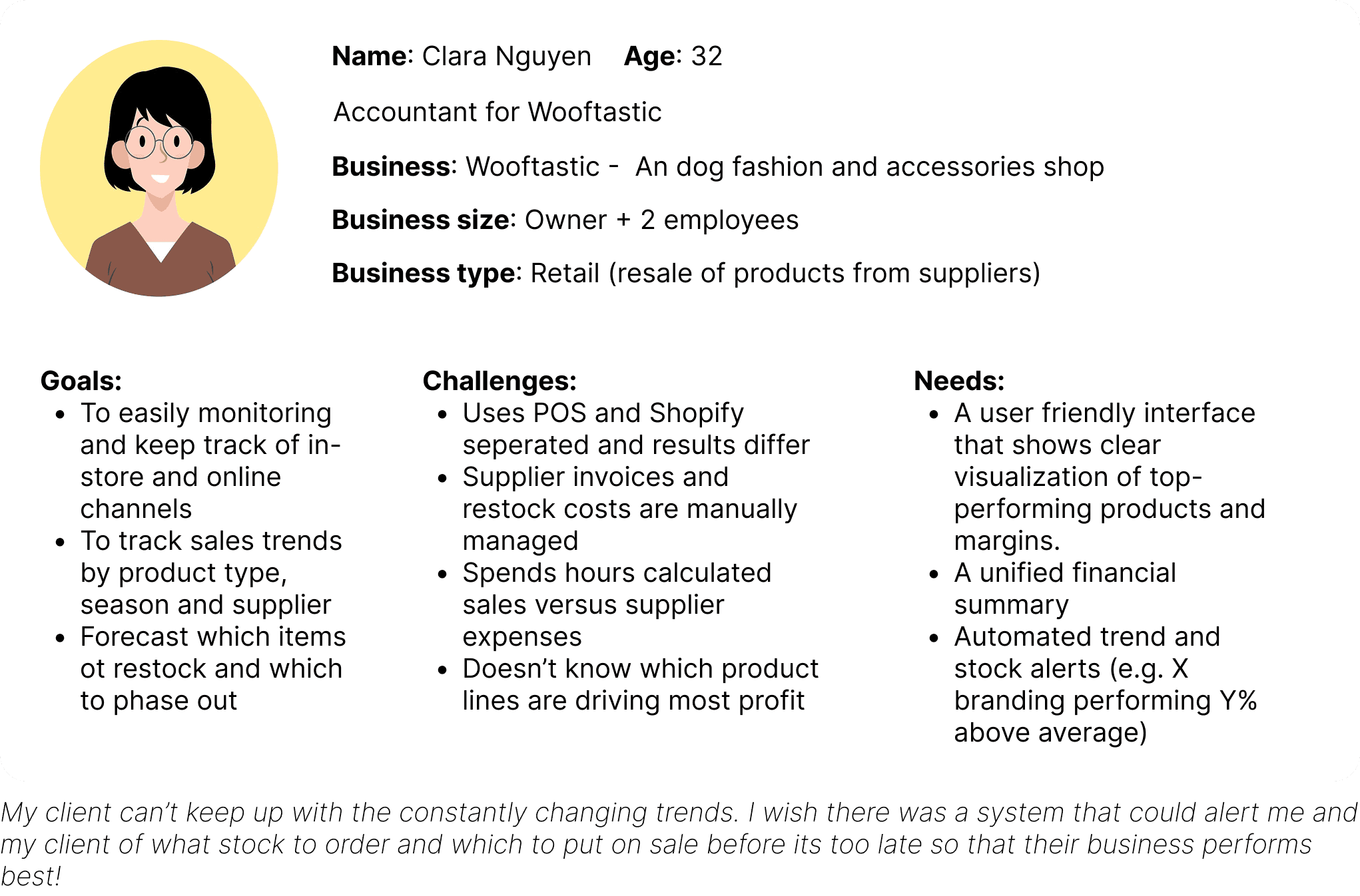
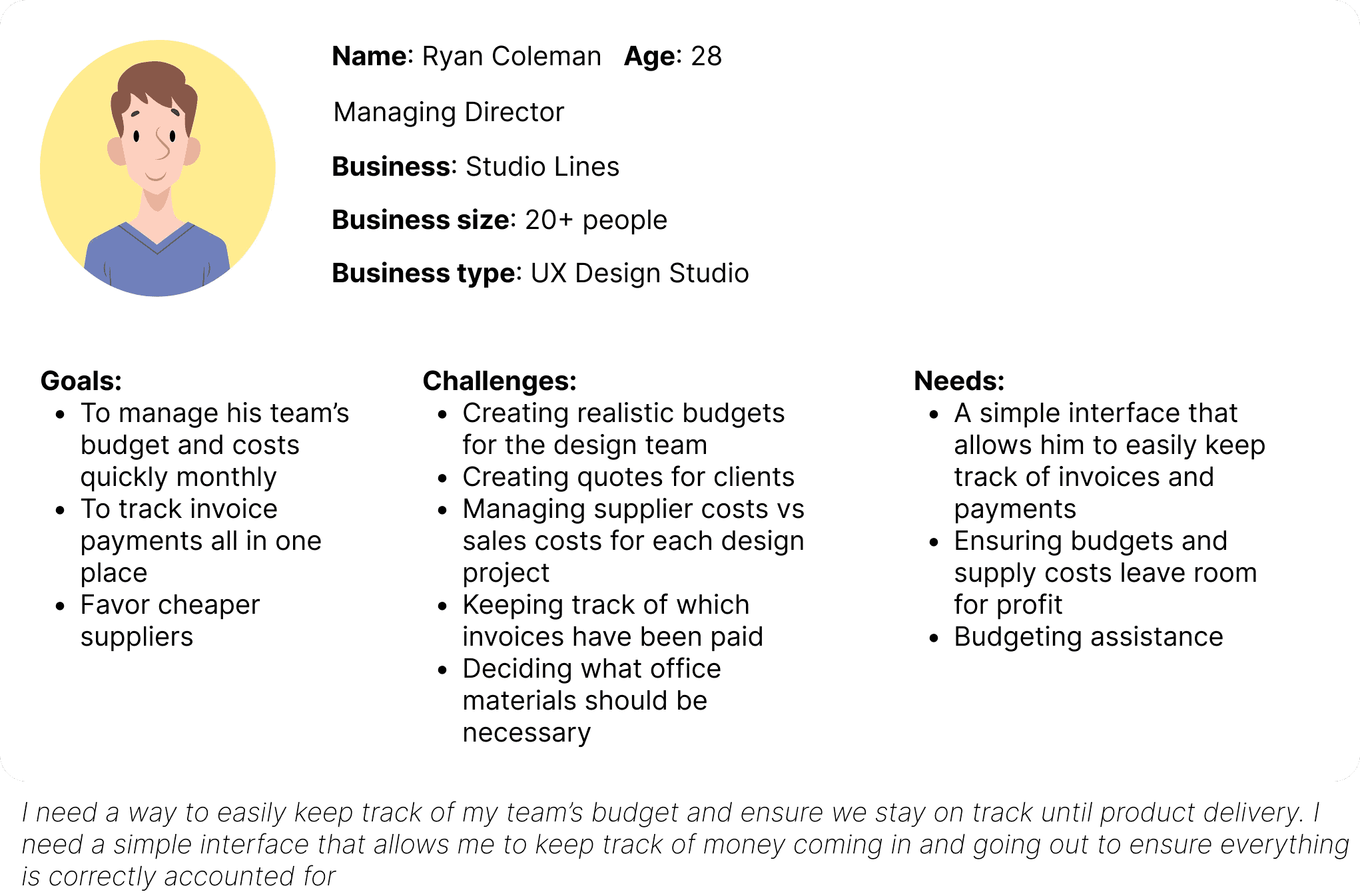
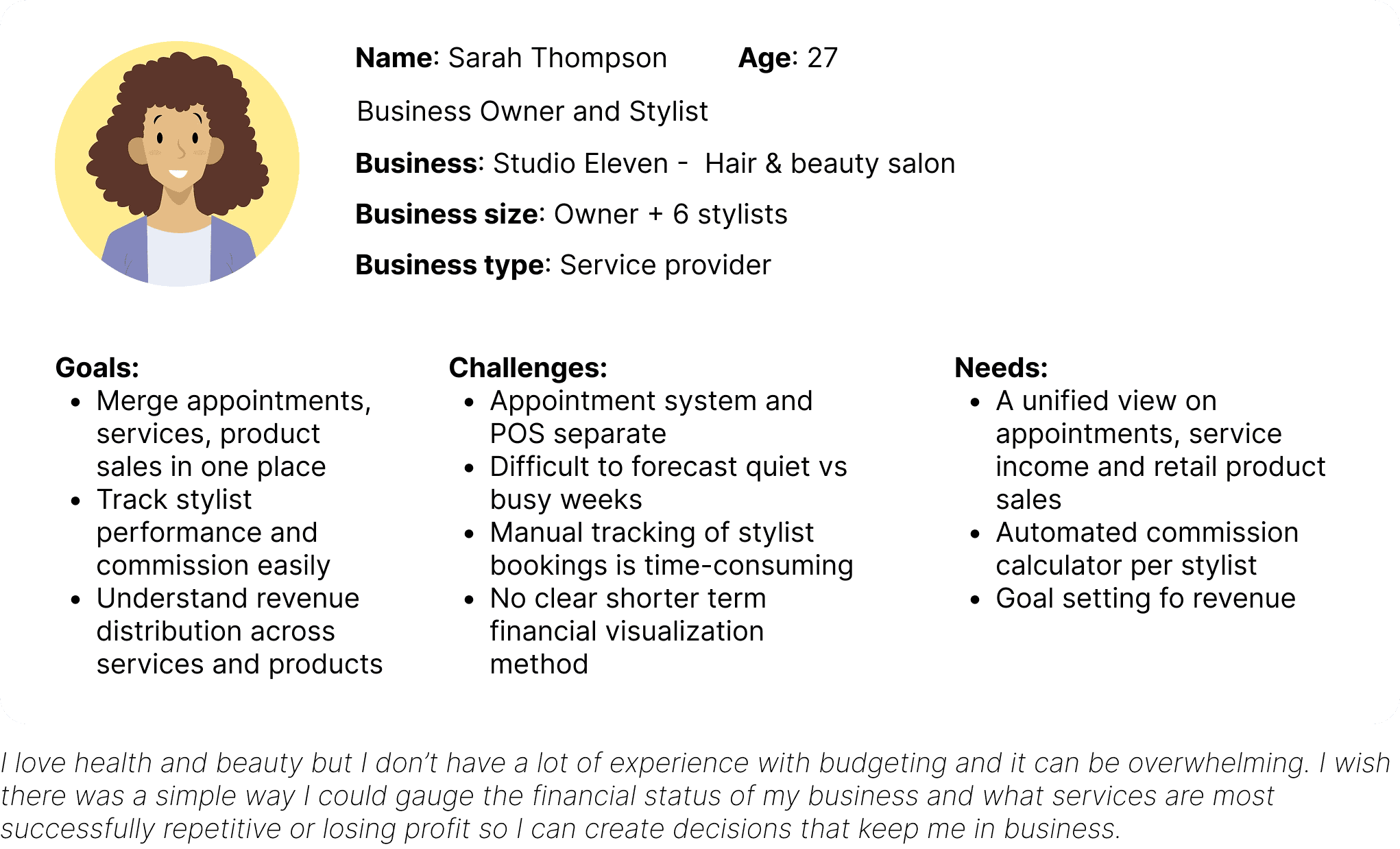
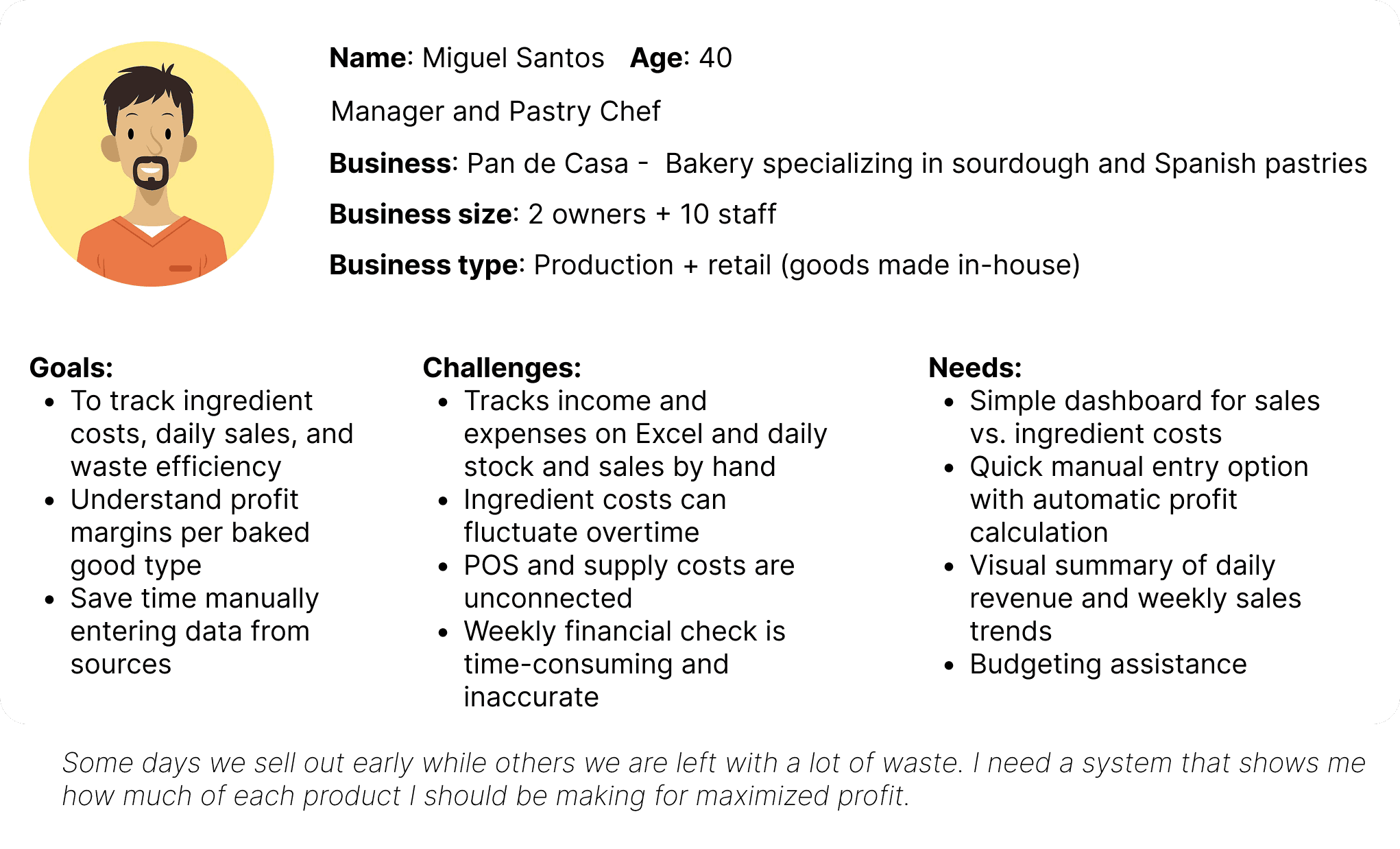
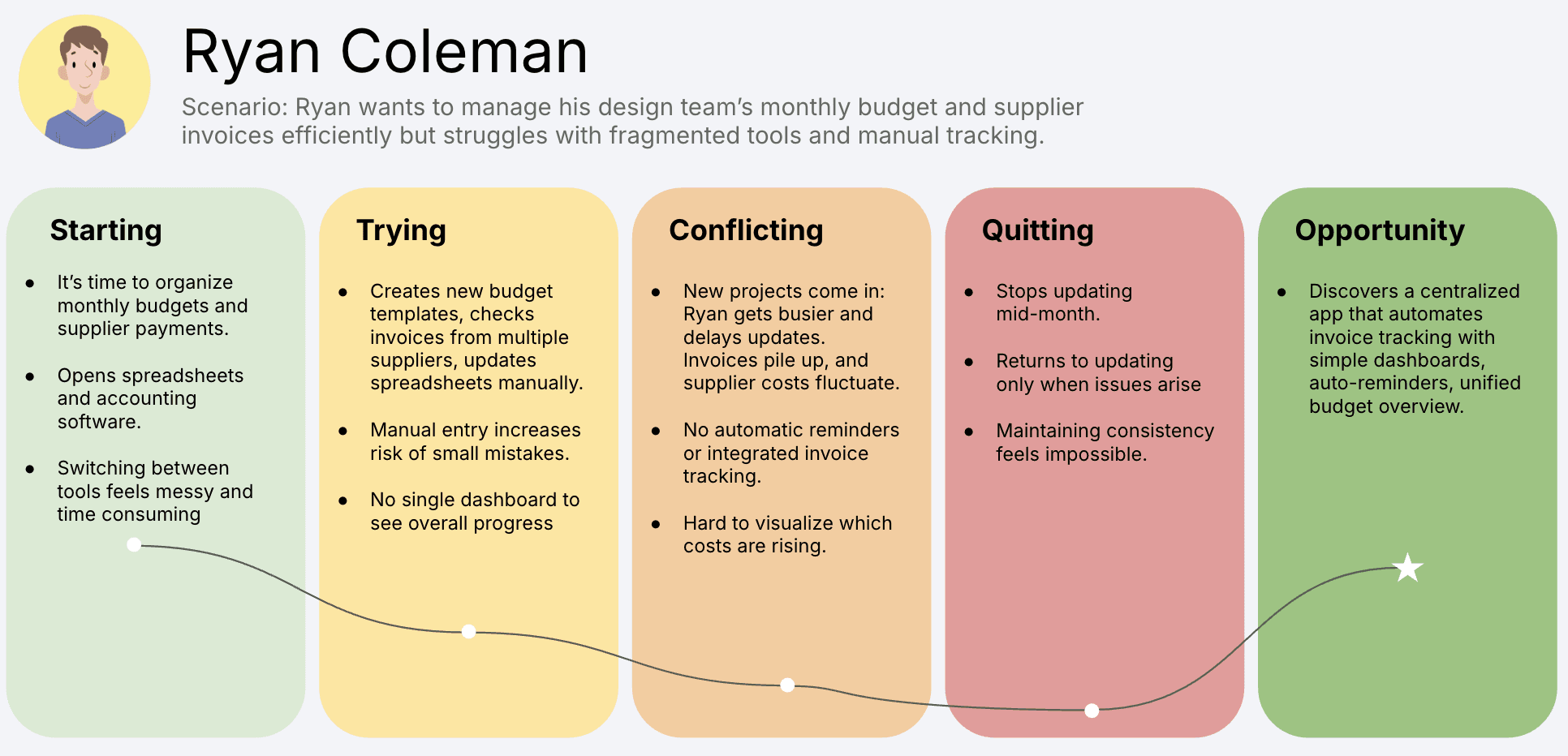
User Personas
I created four distinct user personas to anchor my design direction. Each user persona represents a different small business with their own needs, challenges and goals, which overlapped with those I heard directly from my users in interviews. These helped me keep the solution central to the user’s actual needs and realistic to the issues and variability that exist from business to business.
User Journey Map
RESEARCH
Competitive Market Analysis
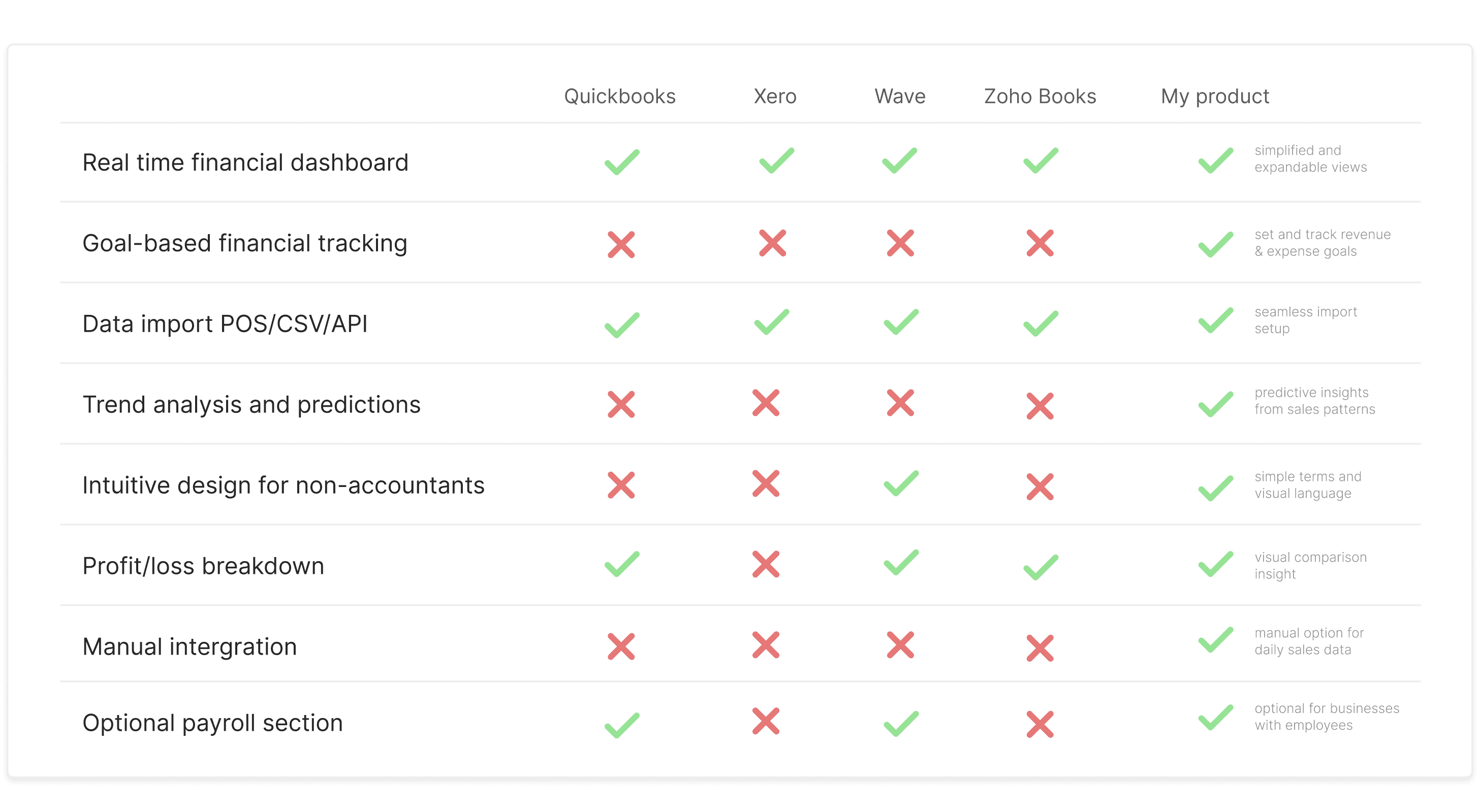
I conducted a competitive market analysis among other existing options to compare usability, find problem areas and understand how financial management websites are usually constructed. The main issues included an overcrowding of information, a lack of hierarchy, lack of actionable insights and data visualisation/metrics being hard to understand. In these market solutions, I saw the range of data visualisations for each metric and wanted to explore the perception and the intuitiveness of different data representations. There was also a large range of metrics being used to track financial performance and I wanted to narrow down what my user group found most important.
I asked my users what metrics they found most vital and what data visualisation methods they found most suitable and easy to understand for each metric below.
IDEATING
Data visualization methods
Information Architecture
With insight from my users I developed the information architecture for the website. Some feedback I got along the way included:
Goals and trends should be combined into one space since they contribute to each other in a sense. (This was combined this into ‘Insights’)
A business's current POS register doesn't connect digitally and only prints out receipts of each days sales. They would like an option that allows them to import this data themselves into the website. (Manual edge case)
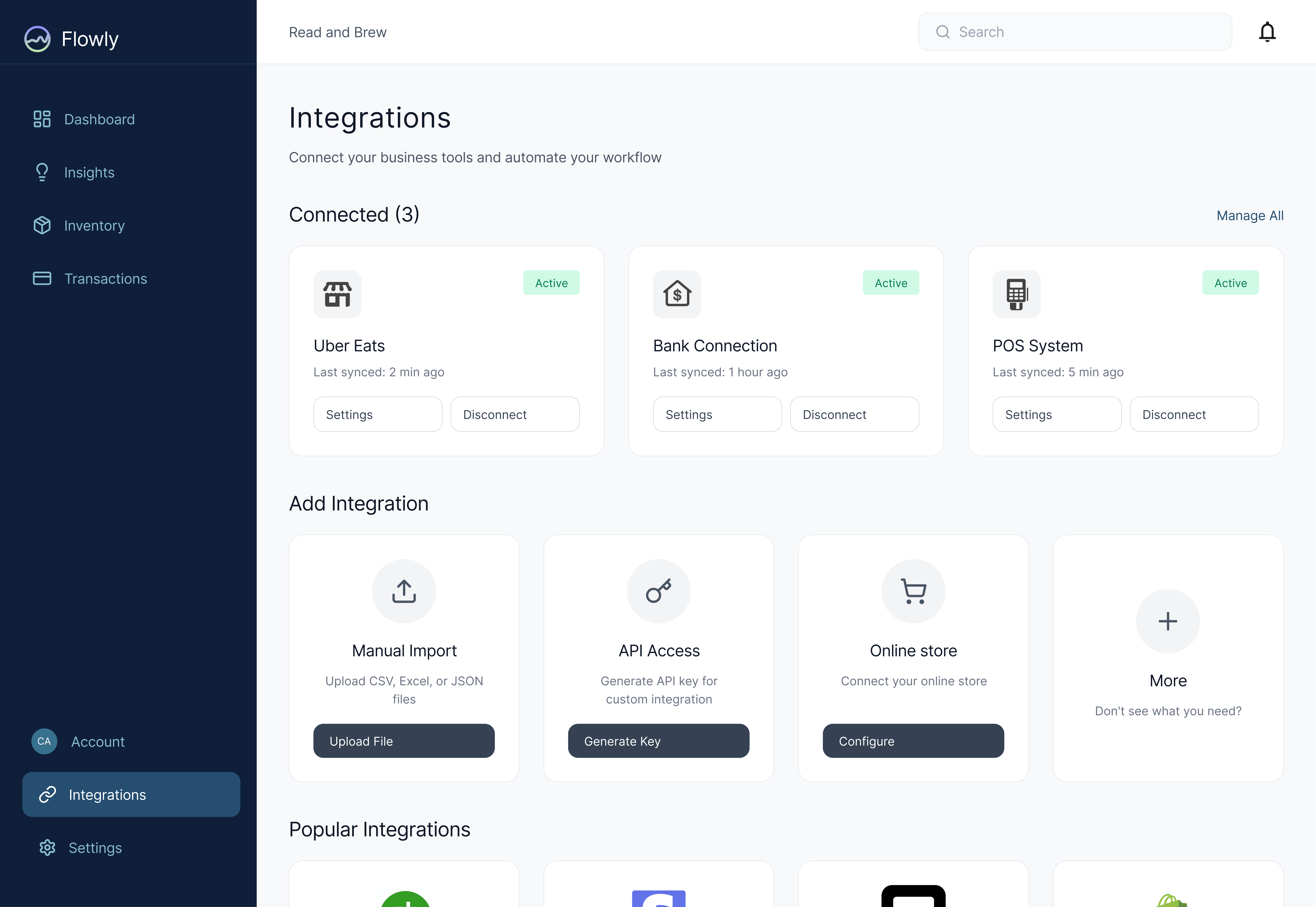
POS integrations, bank APIs and online stores can be grouped under one heading called Integrations to make it simpler and more unified.
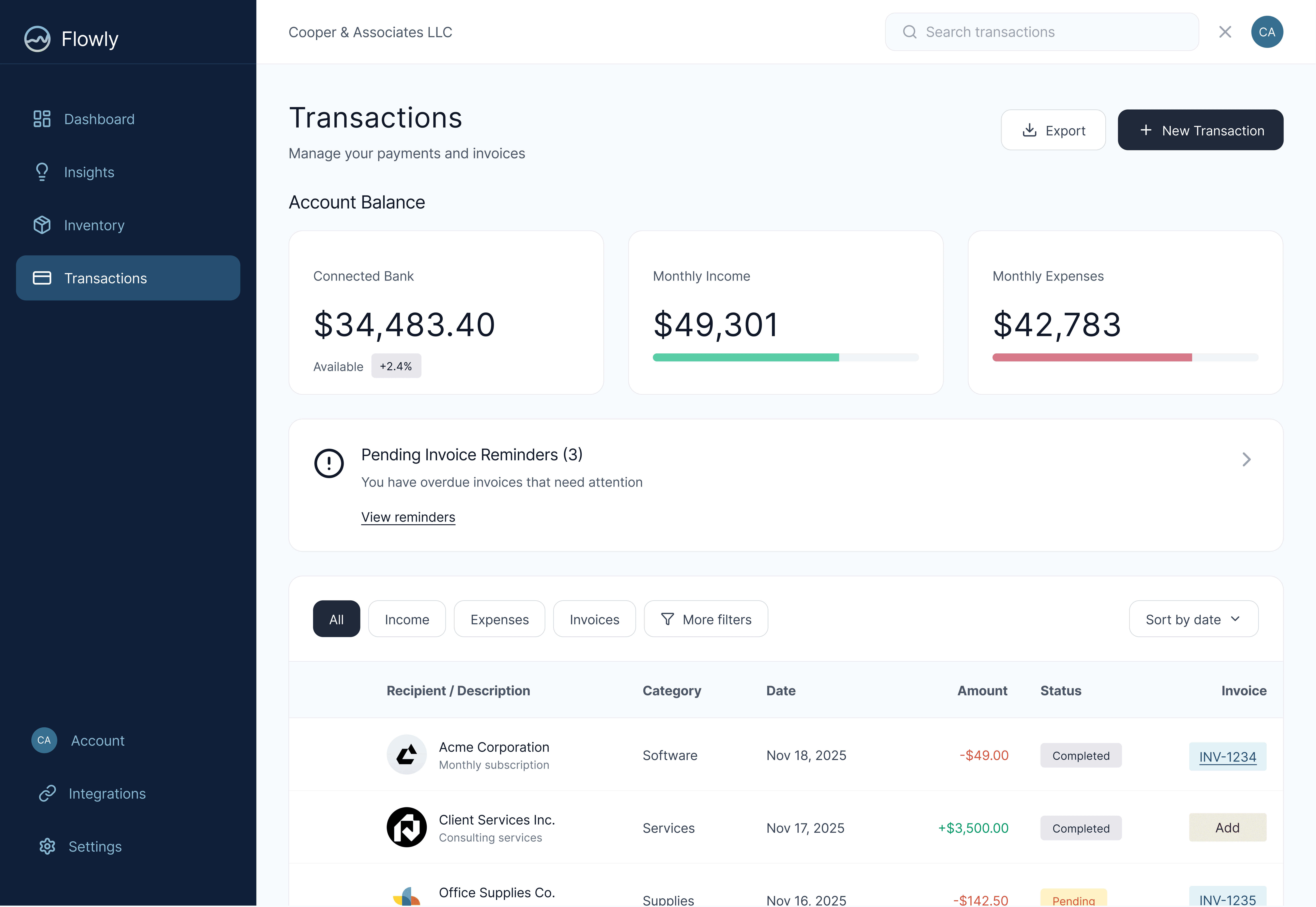
One business owner didn't fully understand what 'invoices and transactions' referred to, as a headline, and suggested a more overarching term. Both Payments or just simply Transactions are more straightforward.
DESIGNING
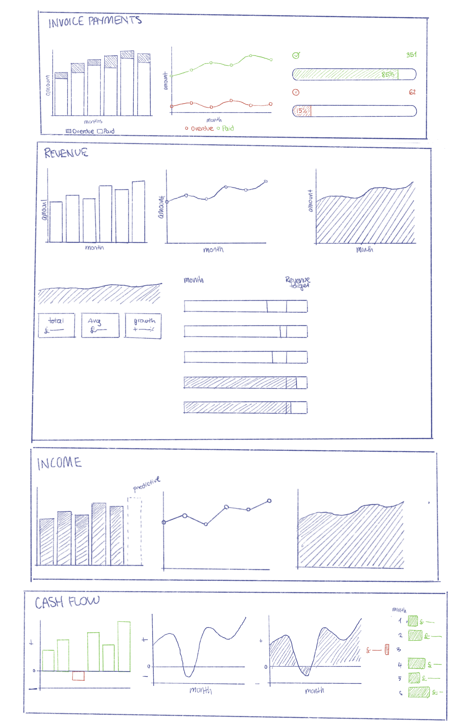
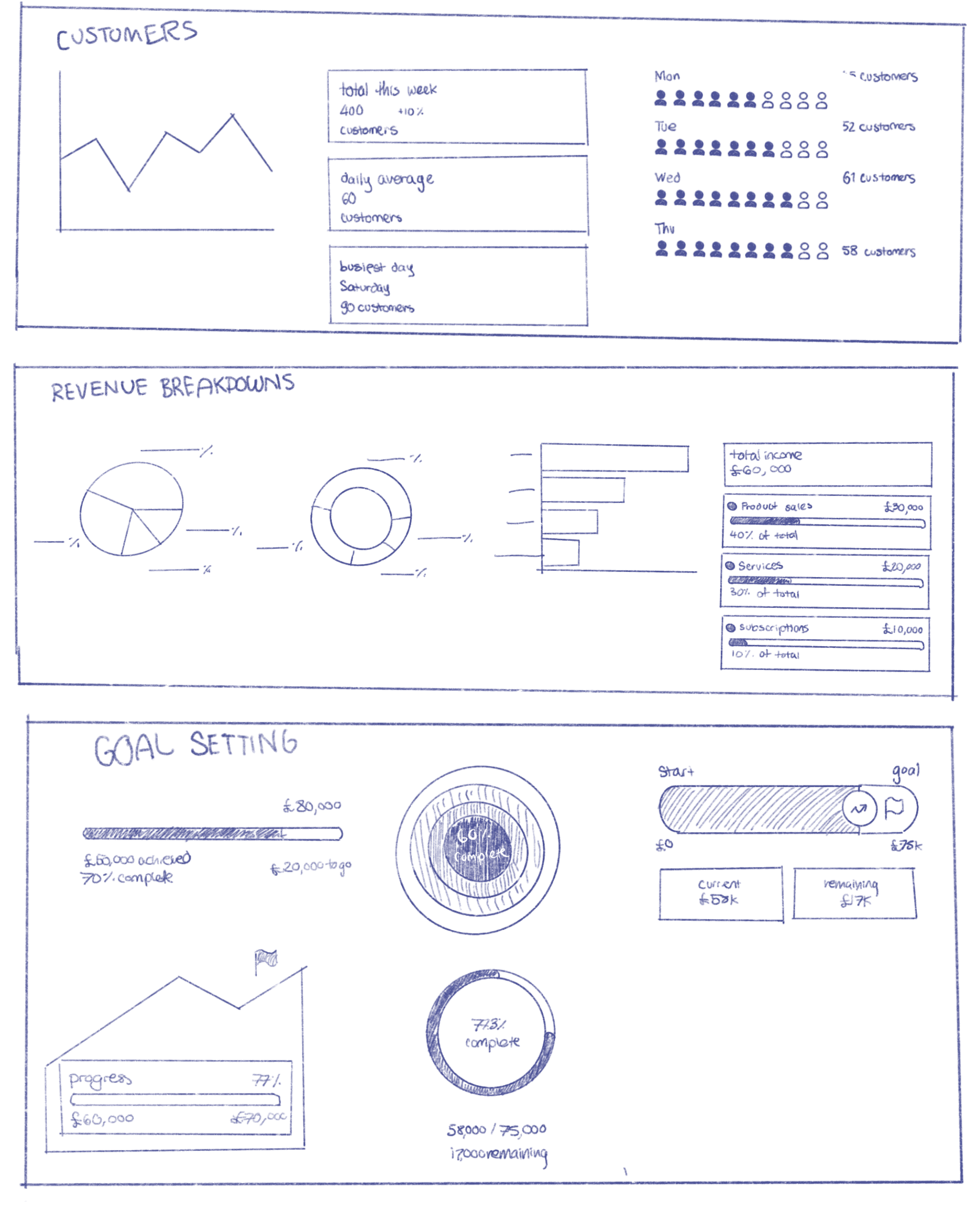
Lo-Fi Wireframes
I explored multiple layouts in lo-fi, focusing on hierarchy, comprehension, and glanceability. My goal was to reduce the feeling of being overwhelmed by data, but still conserve informational depth. I tested different combinations of data visualisation (charts, summaries, and insights) to validate what users could read and understand quickly. This helped me determine which metrics and design elements deserved the most visual prominence which I marked (yellow stars) to later stitch together in mid-fi.
DESIGNING
Mid-Fi Wireframes
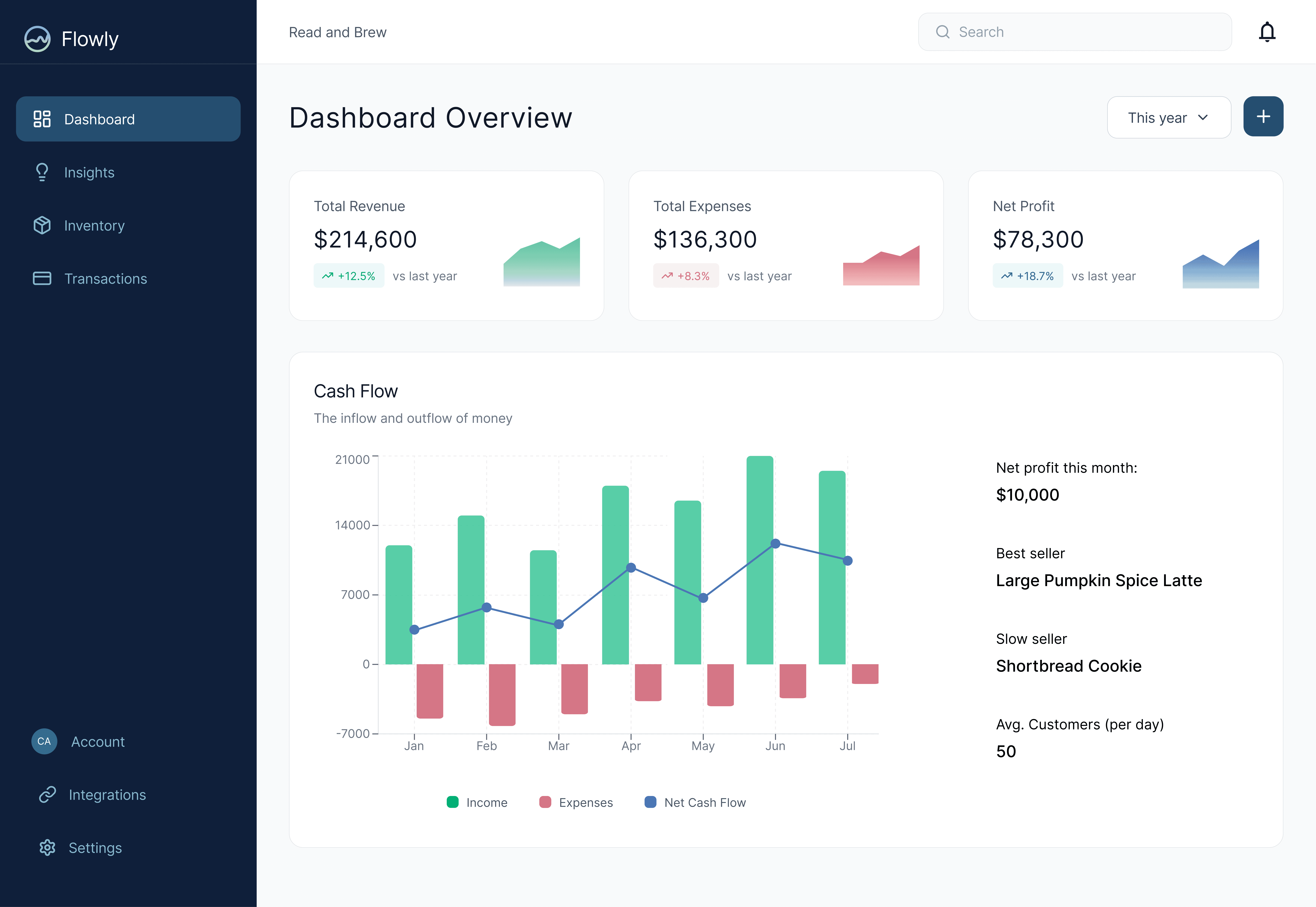
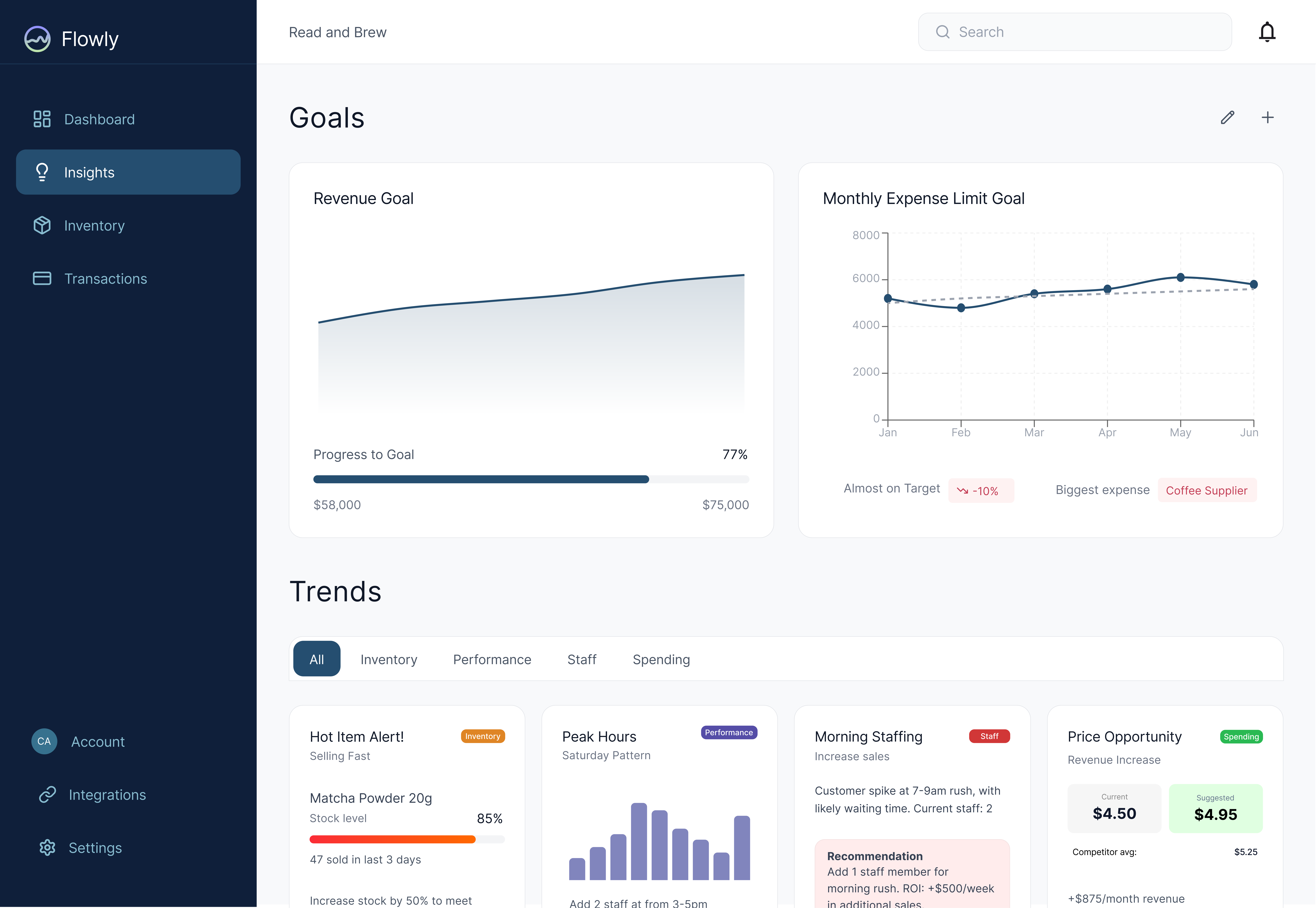
DESIGNING
Mid-Fi Actionable Insights
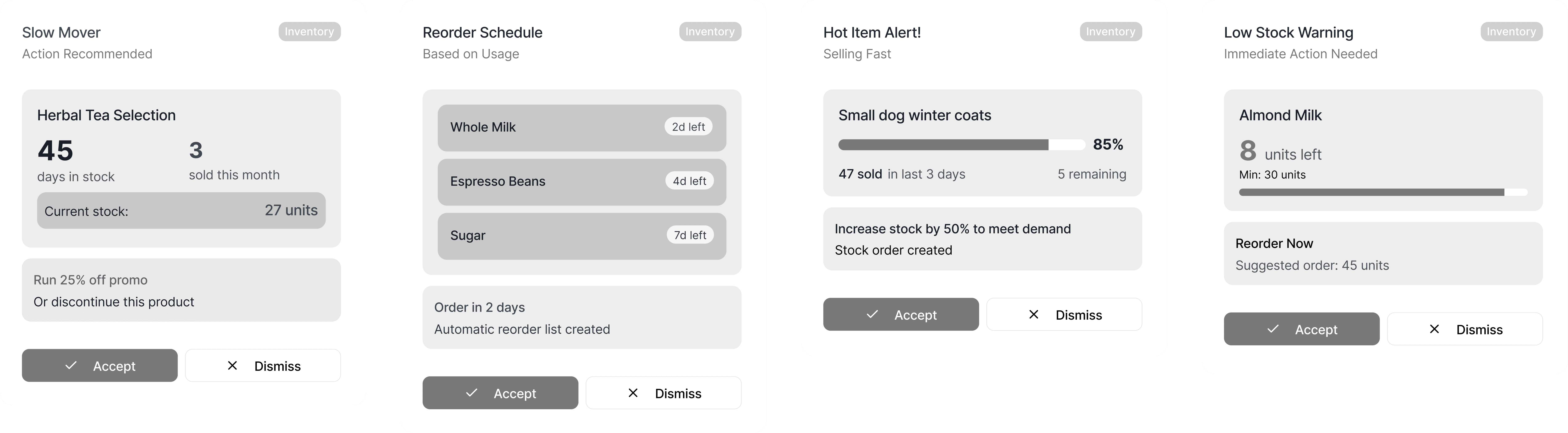
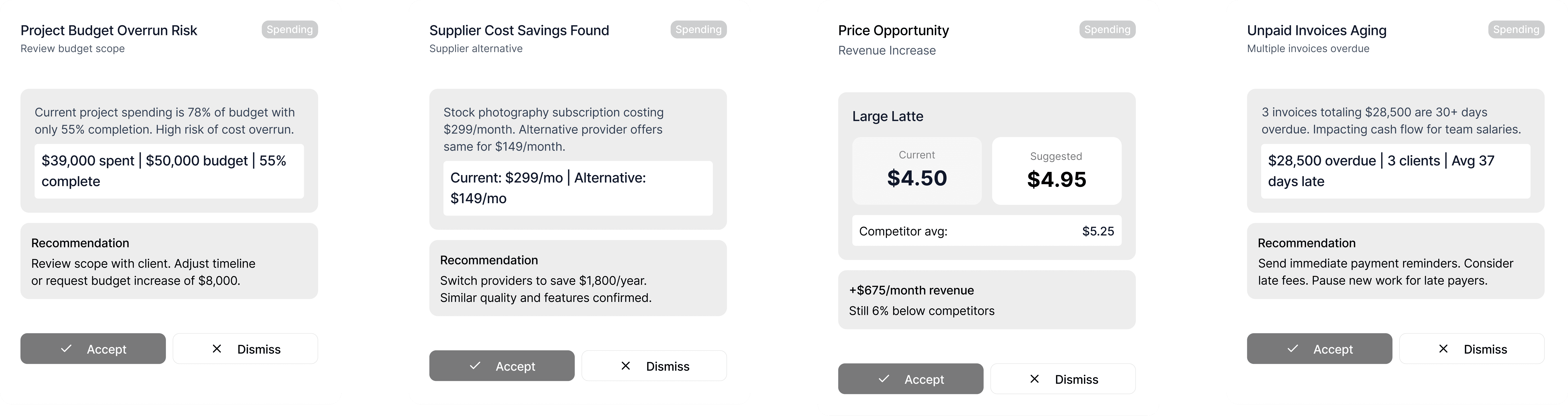
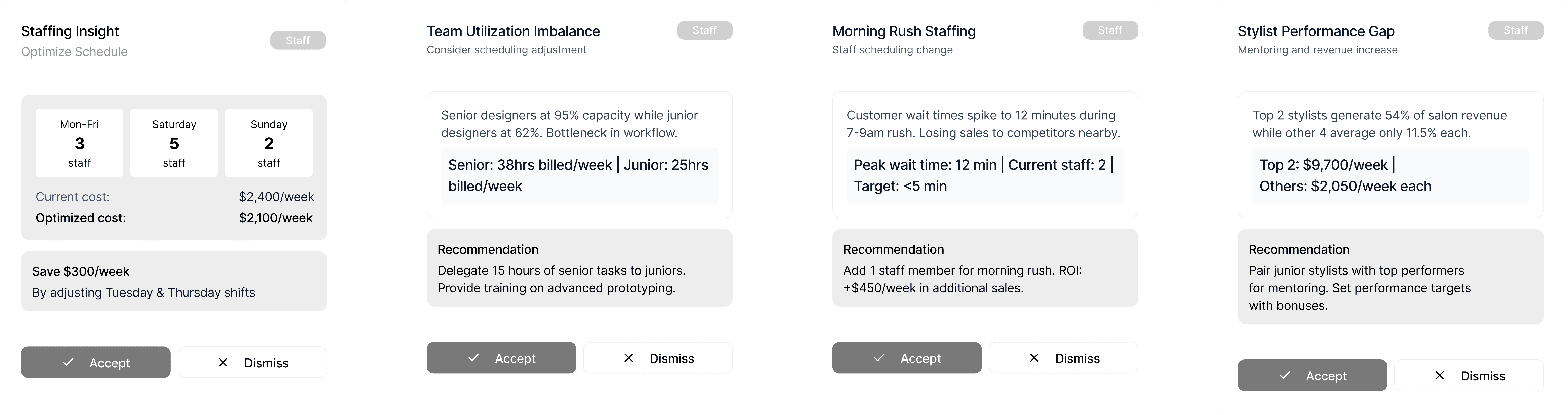
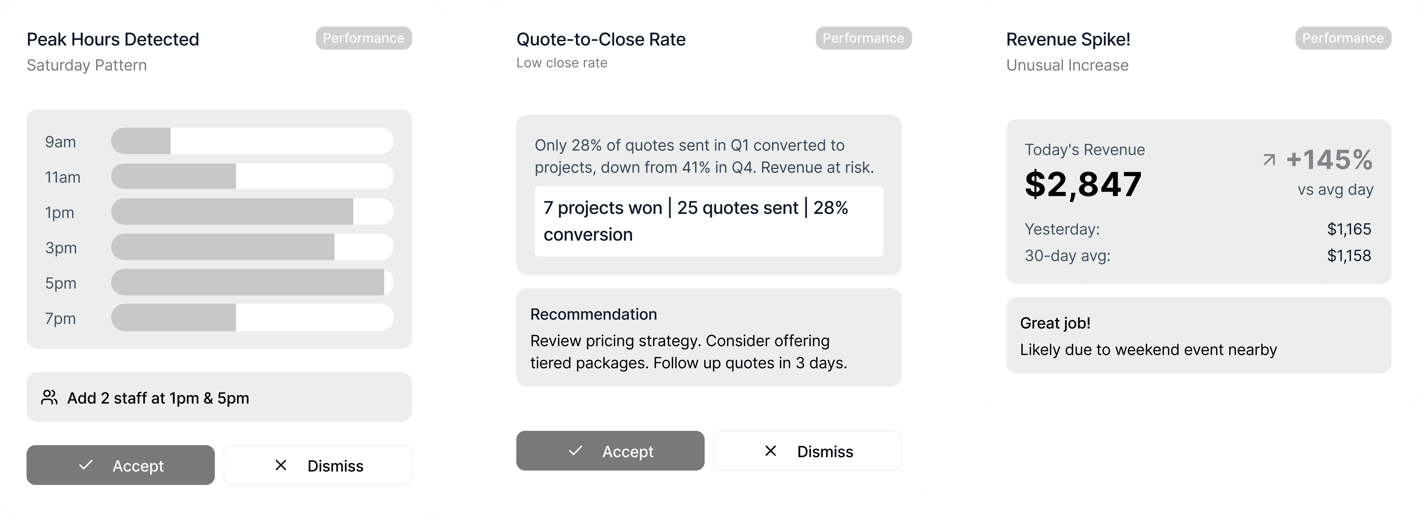
Based on my user personas, I considered multiple actionable insights that could appear under the ‘Trends’ section. There would be four categories that these trends could fall under: Inventory, Performance, Staff and Spending. They would help support users who lack financial expertise. These trend insights could be triggered by detected patterns: rising costs, underperforming products, strong seasonal periods, or over-reliance on a single revenue stream and suggest action items.
They were integral as they would transform the dashboard from a passive reporting tool into an active financial companion, helping them decide what to do next.
OUTCOME
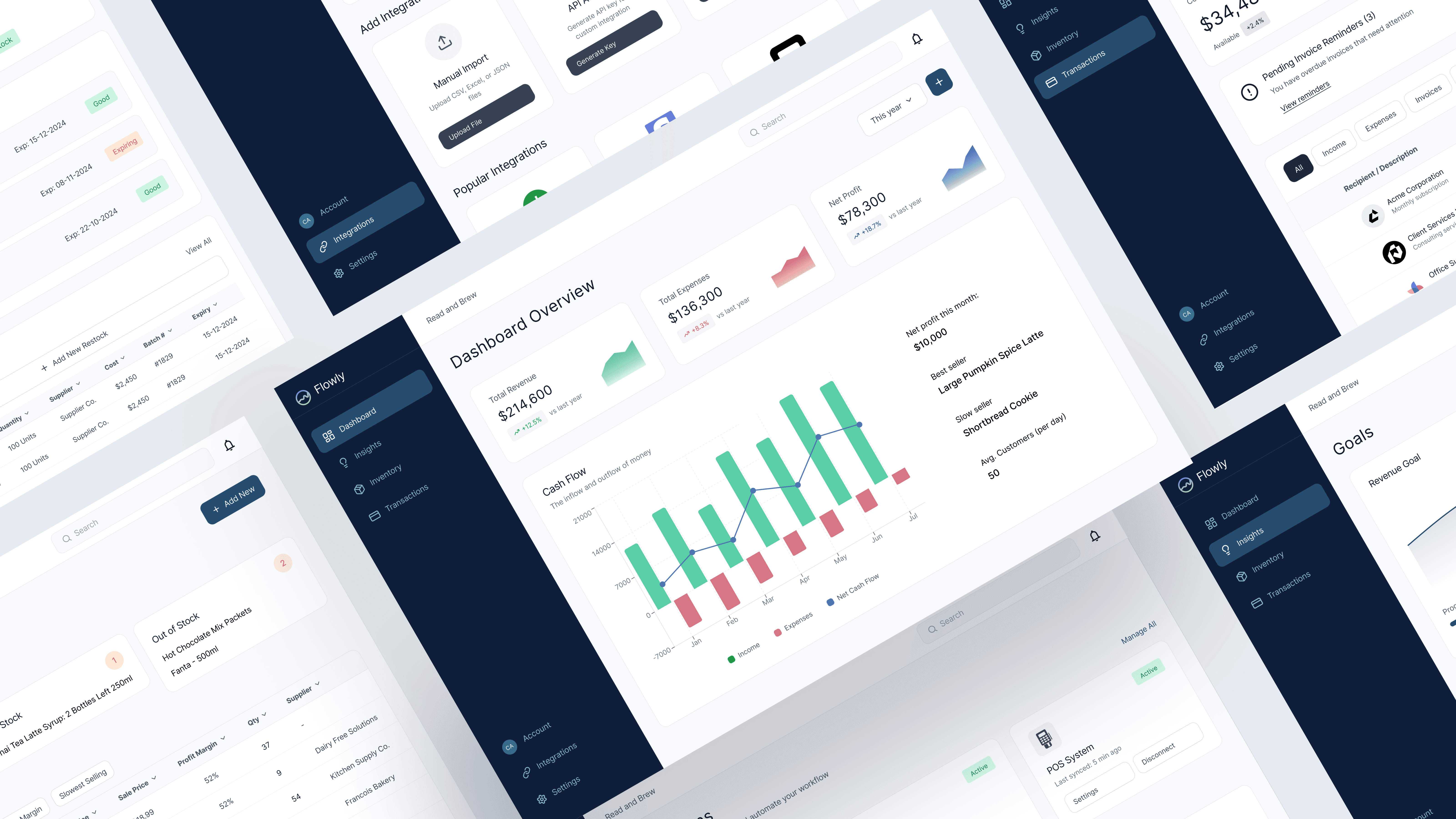
Figma Prototype
All screens

This sprint helped develop more agility to transform complex data into more intuitive experiences. For me, Flowly was meaningful in showing how powerful tools can become more meaningful when they feel simpler. This project reflects my growth in tackling complexity, addressing user needs, and intentional design.
Accessibility considerations
Accessibility was centred throughout this project through cognitive, visual, and situational design considerations, recognising that many small business owners operate under time pressure, cognitive load, and varying levels of financial literacy. To reduce cognitive strain, complex financial data was broken down into progressive, actionable insights rather than being presented as raw metrics, allowing users to focus on what matters most and then delve into details as needed. Clear visual hierarchy, consistent labelling, and limited on-screen data density were used to support quick scanning and comprehension, particularly for users with attention or processing challenges. Meaning is never communicated through colour alone; trends, alerts, and priorities are reinforced through text, iconography, and spatial positioning to support users with visual impairments or colour-vision deficiencies. I also validated colour contrast ratios (WCAG). These accessibility-driven decisions directly informed the final dashboard and insights system, resulting in an interface that prioritises clarity with inclusive decision-making, rather than overwhelming users with financial complexity.
VALIDATION
Peer Testing
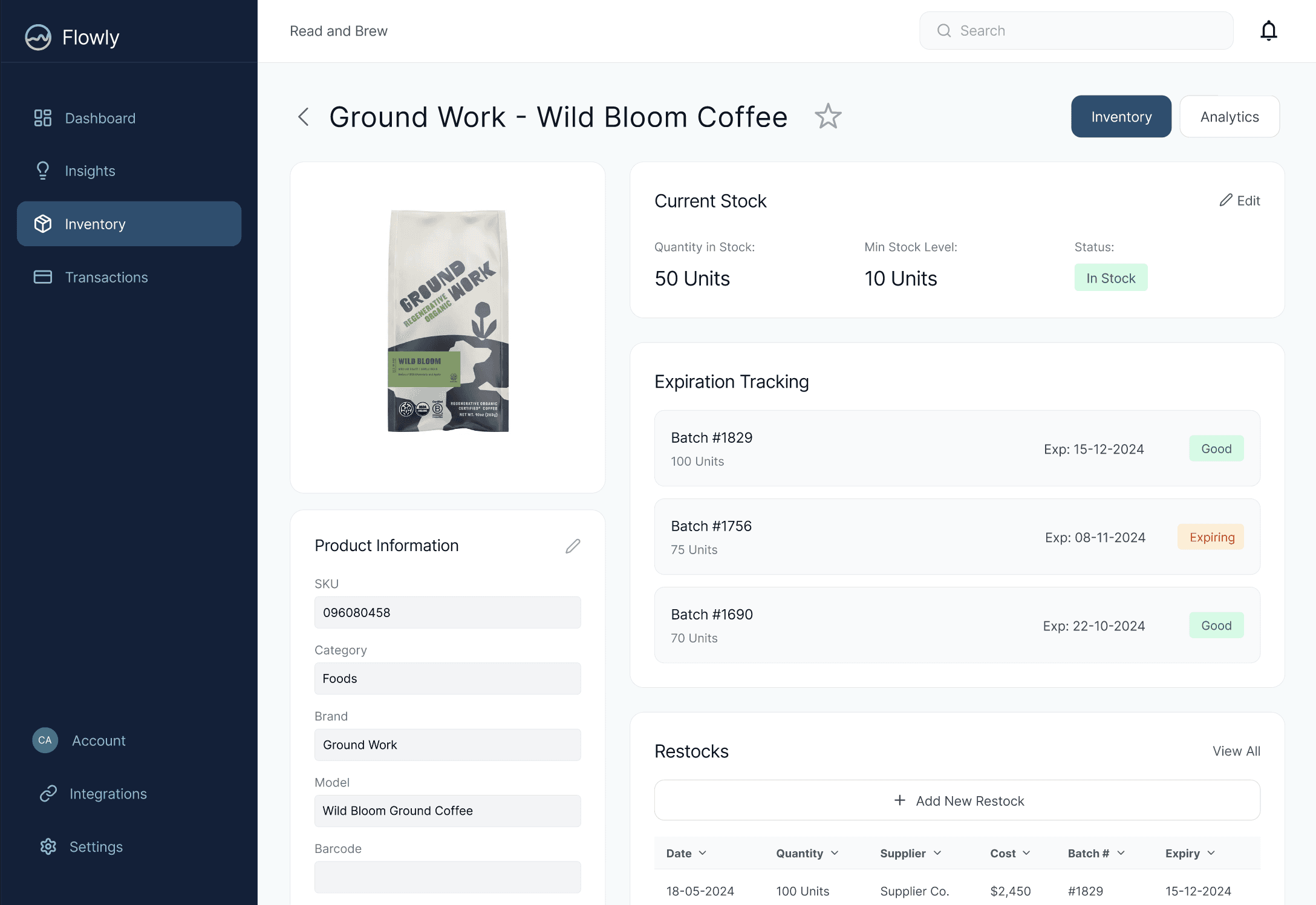
I tested my prototype among four of my peers to see if the product was intuitive to use, specifically choosing a variety of testers, specifically ones with low financial literacy and reading disabilities. I compiled three tasks for completion:
Check the stock level of “Ground Work” Coffee Beans of store
Navigate to connect to an online store
View what items are selling fastest in the store
All participants were able to complete the three tasks with an average completion time of under 30 seconds. Some critical feedback and suggestions that I got and will take into consideration for improvement include the option filter by date range for Trends and Goals in Insights, and a visualisation of each stock item’s stats. The overall user satisfaction rating I got from these test users was a 4.5/5. They felt that the categorisation of main tasks was easy to navigate without much cognitive effort, and the graphics helped visually justify different statistics. An improvement suggested for accessibility development would be to ensure colour contrast is viable among those with eye impairments, and text size can be greatly altered with the proper arrangement of design elements.
Overall, this project was an immersive exploration into a fast-paced design sprint in an area of expertise that is highly specified. I enjoyed working to fully understand the needs of my target users and how such a design could fill the gap in the market for those users. If this product moved beyond the sprint stage, I would validate by running further usability sessions with actual small-business owners to validate how well Flowly fits their day-to-day routines and challenges as well as accomodates finacial literacy and learning disabilities. I’d also want to prototype deeper accessibility and data-visualisation features to make financial clarity even more inclusive and actionable.