
Freshview
Freshview is a passionate project I completed outside of my university studies. With the intention of preventing food waste and overspending in domestic households, I designed a mobile app for multi-person households which would help streamline grocery shopping and food management.
The main features that constituted the mission of the app included: the app’s ability to track and notify users of expiry dates, generate recipes from food inventory and expiring foods, and create a unified digital grocery list for households. It was essentially a household-synced digital fridge that could be accessed from anywhere.
Project type
Independent
Areas of work
UX Design
Prototyping
Testing
User research
UI Design
User flow
Softwares
Figma
Adobe Creative Suite
Miro
Old Fashion pen & paper
Timeline
May - June 2024
Design Process
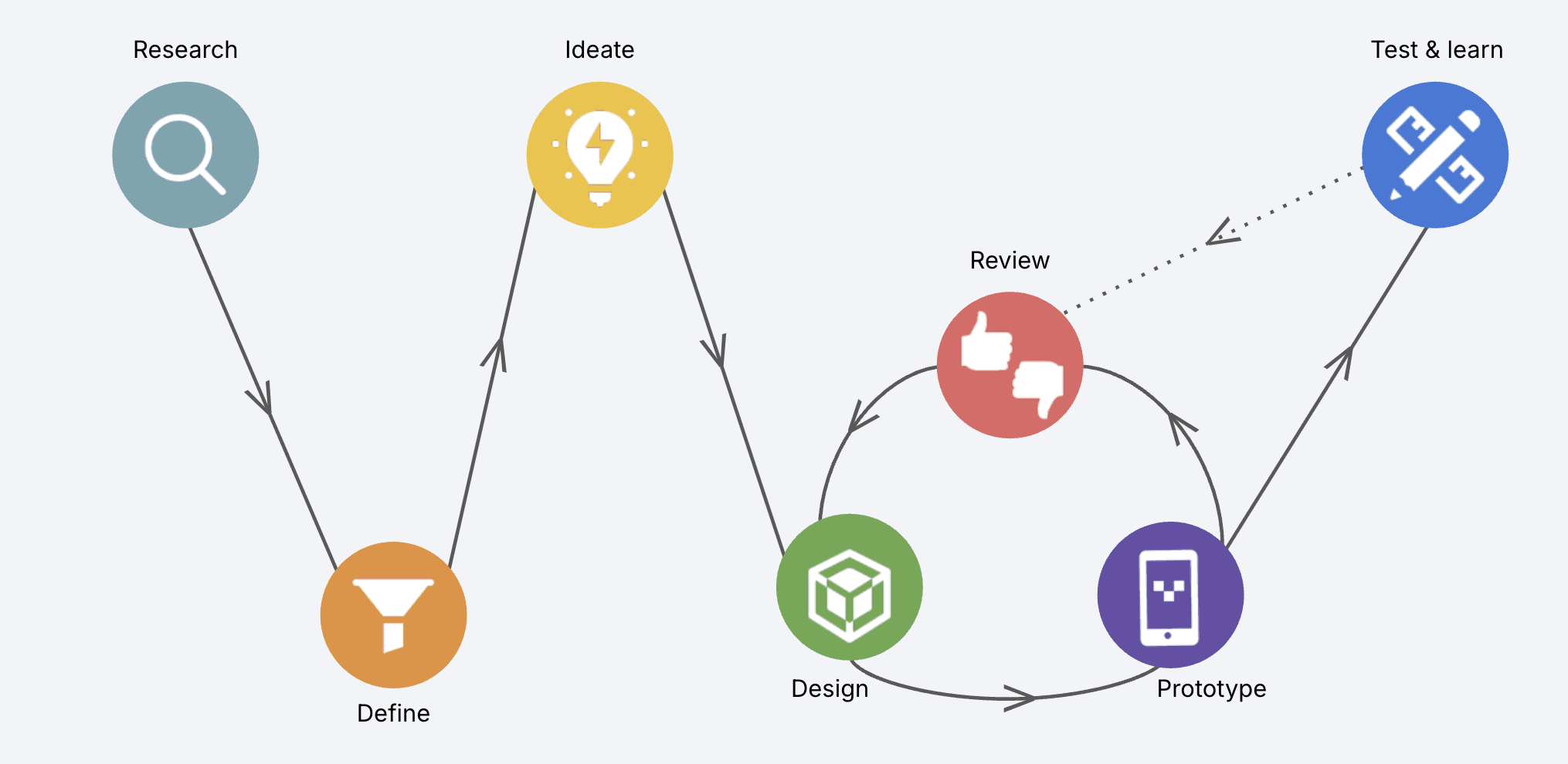
RESEARCH
Exploring the Problem Space
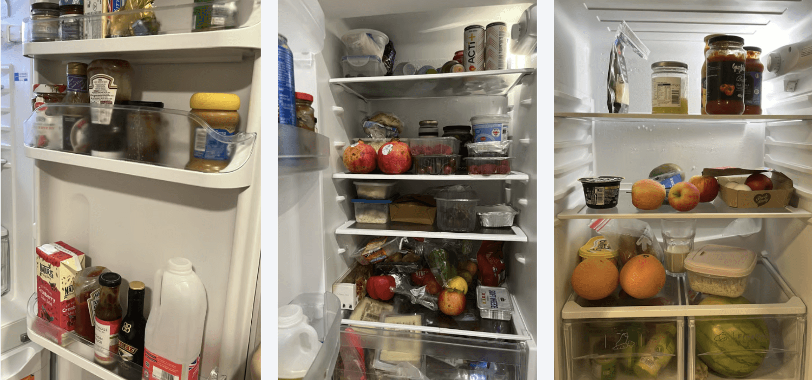
Since I had full autonomy over this project, my starting point wasn’t directly about solving food waste but rather to explore the broader experience of grocery shopping, and its pain points: this was the brief that I gave myself.
I conducted a task analysis, documenting actions, emotions, and challenges throughout the shopping journey, from before being inside of the grocery store, up until packing away my food items in the kitchen and eventually using those items. By mapping this complexity, I began to see patterns and moments of frustration, inefficiencies, and opportunities for improvement, which I marked in blue sticky notes in this page. This later helped me define early ideas that would shape the specific problems that my app would address.


White Paper Research
Most wasted foods in the UK: Potatoes, bread, milk bananas, salad/greens
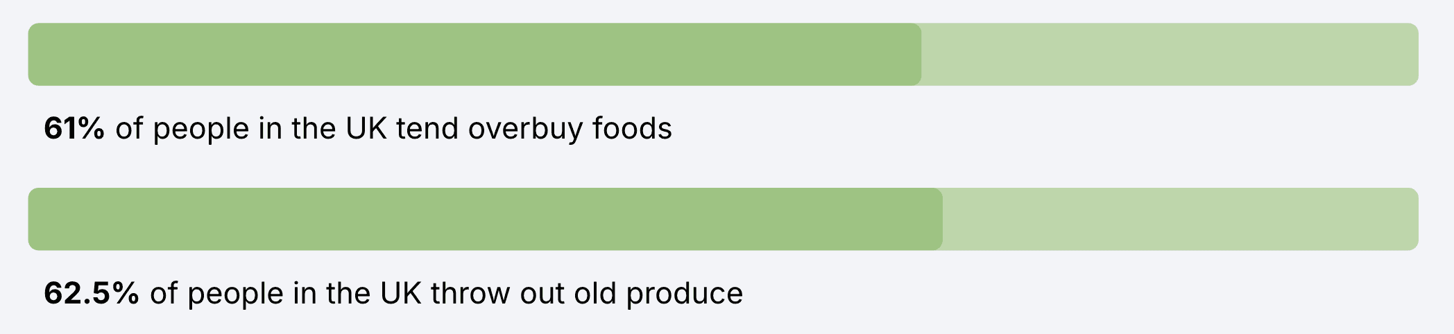
9.5 million tonnes of food waste per year, just in the UK
28% of people freeze produce/herbs before expiration
User Interviews
To better understand user pain points from a qualitative perspective, I interviewed 6 users on their experience with food management, grocery shopping and the likelihood of food waste in their household. Although I worked independently on this project, collaboration was still central to my process. These user interviews and their voices directly shaped how I defined and prioritised problems. I treated users more like collaborators, allowing their perspectives to guide my design direction rather than just my own assumptions.
I prioritised key areas that I would focus on, based on these interviews. This included food waste, grocery list planning, budgeting, meal planning, and a balanced diet. I prioritised food waste as the central challenge of my design going forward as it combined a great deal of user frustration with a larger social and environmental impact. The other areas (e.g. planning and budgeting) were incorporated as supporting aspects, since all these issues reinforce each other in the broader system.
Extracted quotes
“Often with my partner, I don’t know what food we already have and sometimes we double-buy”
“I forget about food hidden in the back of my fridge and it can rot there for weeks before I notice.”
“I often use up all my monthly allowance on groceries before the end of the month.”
“After I make a meal, I have leftover ingredients I don’t know how to use.”

DEFINING
Pain Points
Grocery list planning
Food waste
Budgeting
Balanced diet & cooking
PROBLEM STATEMENT
Domestic multi-person households struggle to manage food efficiently due to fragmented communication, lack of visibility into shared inventory, and cognitive overload when planning meals, shopping and cooking. These issues lead to avoidable food waste, overspending, and frustration.
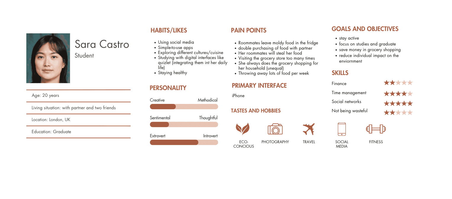
User Persona
I created user persona to anchor the problem space: Sarah Castro. Her frustrations reflected those I heard consistently in my research. She often forgets expiry dates, feels guilty about wasting food, and struggles to coordinate shopping lists with others in her household.
By framing my design around Sara, my design choices addressed both functional pain points and emotional drivers I heard from users.
REFINING
Competitive Market Analysis


To make sure I wasn’t designing in a vacuum, I conducted a competitive analysis on three apps: CozZo, Fitbit, and Yuka.
CozZo was the the only app I could find close to my problem space, but I found its execution lacking. The digital fridge was essentially just lists with little visual engagement, poor interaction design, and unintuitive navigation. This taught me that even if a concept is strong, if the system feels visually and interactionally heavy, users won’t adopt it.
In contrast, I looked at Fitbit, which is very different in purpose, but similar in handling a lot of complex, varied data. Fitbit demonstrated how even data-heavy apps can feel intuitive, calming, and engaging through clean layouts, clear hierarchy, and smooth interactions.
Finally, Yuka showed me how food items could be prioritised and organised visually, and info can be extracted through barcode scanning. This also made me think about which information about food is most important to surface and guided my own layout and prioritisation.
User needs & Feature Development
User needs:
Keep track of their fridge items
Stop wasting food
Visual clarity of all food items from anywhere
Not double buying items
Functions:
Expiration notifications
Visual inventory of fridge
Barcode scanning food items
Collaborative grocery lists

DESIGNING
Lo-Fi Wireframes
User Flowchart
PROTOTYPING & TESTING
Quick Draft Prototype
I developed my first high-fidelity prototype: translating the structure into a interactive system that I could test with users and evaluate. The most significant areas for improvement was the visual language and interaction design, which needed much refinement.
This stage showed me that a prototype is never the endpoint, but rather, a tool for learning and iteration. From users feedback, I rebuilt an app prototype in Figma with more advanced interactions, a clearer hierarchy, and a refined visual system.
REVIEWING, LEARNING, IMPROVING
The Final Outcome on Figma
Key Improvements
Expiring food hierarchy: clear urgency with expiring items appearing bigger and first at the top.
Following Hick's Law (a psychological theory): “The more decisions available, the longer it will take to create a decision.” The top section with the ‘expiring soon foods’ prevents such decision fatigue, thus lessening the cognitive load to allow for smart, quick decision-making to occur.
Edit functionality: a clear and controlled process of deleting food items for users. Micro-interactions provide users with confidence by making state changes explicit, without cluttering the main dashboard when not necessary.
Interaction design for accessing the menu: Micro interactions and animation out of the fridge view gives a clear and satisfying signal that states have shifted. This spatial transition gives the app a sense of directionality and physicality, making the app easier to navigate intuitively by bridging the gap between the digital and physical.
App Features

AI Integration


I experimented with where AI could be integrated into the app to maximise leverage and deliver the greatest user impact. Within the recipes area, short, simple recipes could be AI-generated based on existing recipes, specifically working off of what a user has within their fridge (and possibly integrating non-perishables outside of the fridge).
This could help users when they didn’t know what to do with specific leftover ingredients of food items. For more experienced cookers, it could just offer an opportunity to spice up their routine meals. Users therefore don’t have to put any cognitive effort into figuring out how to use leftover ingredients as the app can suggest multiple possibilities just off of a few ingredients.
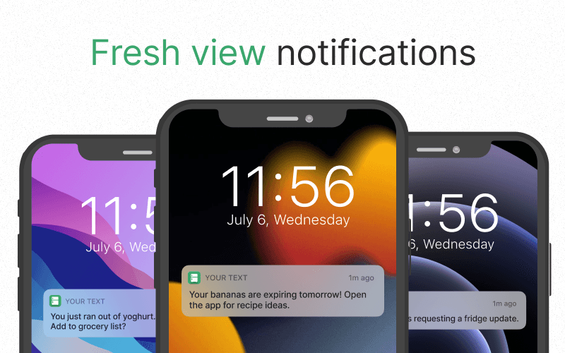
Sample Notifications
MOCKUPS
Hi-Fi Wireframes


Key Takeaways
This project taught me how to handle complex, messy systems by breaking them down into manageable flows and hierarchies. What began as an exploration of grocery shopping became a focused tool for reducing waste.
I learned the importance of micro-interactions in building trust. Even small gestures like swipe actions or smooth transitions make the difference between just a functional product and one that feels intuitive and engaging.
This project also reinforced for me the value of iteration and autonomy. I taught myself advanced tools and kept refining until the system felt cohesive.
I made a point to incorporate collaboration (user interviews or designer peer feedback) as I think within UX design, it's important to challenge and improve my thinking.
Impact & Measurement
To evaluate success, I relied on my critical user journeys to represent the mvp and determine if the product is solving the user core problem and not just driving engagement. Each journey in the table below directly maps back to the original CUJ defined earlier: incl. understanding what’s in the fridge, identifying items close to expiry, and using those items with minimal effort.
All design decisions prioritised one of these journeys. I tested these journeys with 3 users by giving them concrete, task-based prompts, measuring whether the task was completed and how much time it took. If Freshview were to be launched, these same journeys would form the basis of ongoing success measurement. By grounding design decisions in critical user journeys and measurable outcomes, I was able to move from a broad problem like food waste to a focused, testable solution that prioritises real-world impact.

Accessibility, Environmental & Social Impact
Freshview was designed through an accessibility and social impact lens, recognising that food management often occurs in situationally constrained contexts such as multitasking, fatigue, or shared household responsibilities. To support cognitive and motor accessibility, the app reduces reliance on memory through visual prioritisation of expiring items, notifications as external memory aids, and low-effort input methods such as barcode scanning with manual fallbacks. Clear hierarchy, minimal decision points, and spatial navigation patterns help reduce cognitive load and support users with attention or executive function challenges. From an environmental and social perspective, Freshview addresses the systemic issue of household food waste by making food expiration visible, shared accountability, and actionable nudges. By supporting more inclusive food management habits across multi-person households, the outcome can reduce waste and overspending as well as contribute to more sustainable consumption patterns, thus also lowering the emotional guilt often associated with food disposal. These considerations directly informed the final product experience, positioning Freshview as a tool for individual empowerment and a greater collective environmental impact.
All Screens
