
Flowly
A finance dashboard that tells small business owners what their numbers mean, and what to do next. Designed and tested in a five-day sprint.
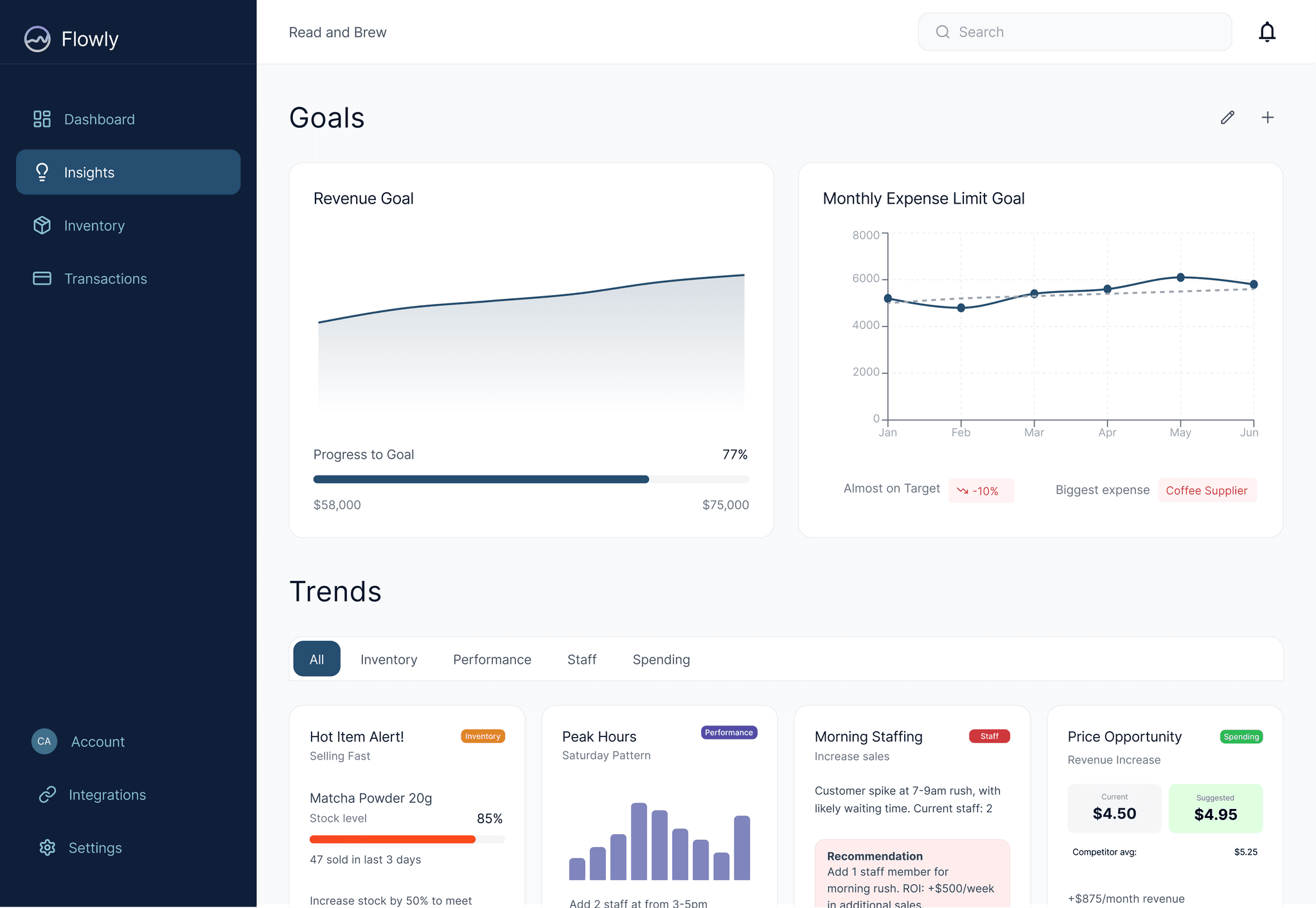
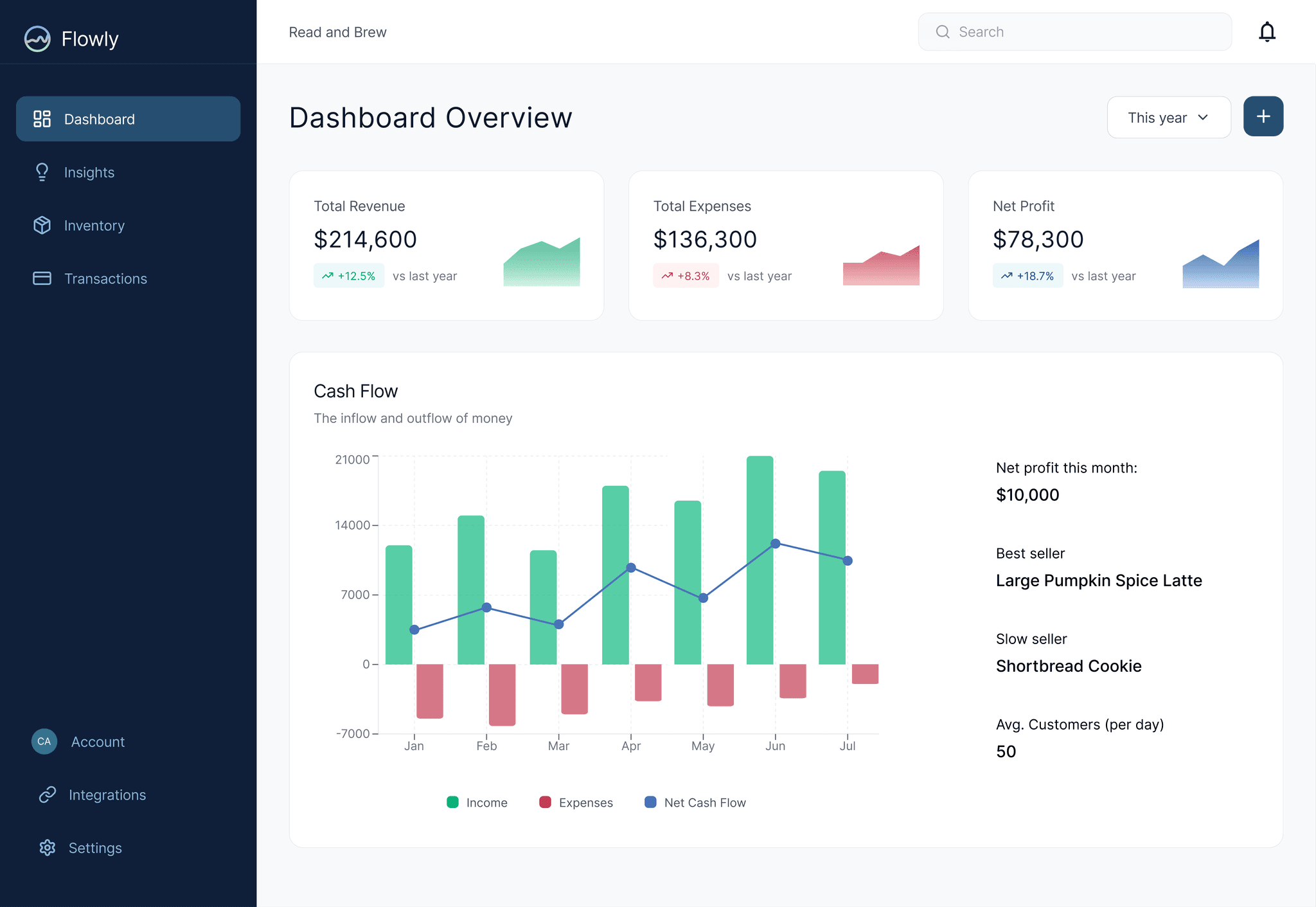
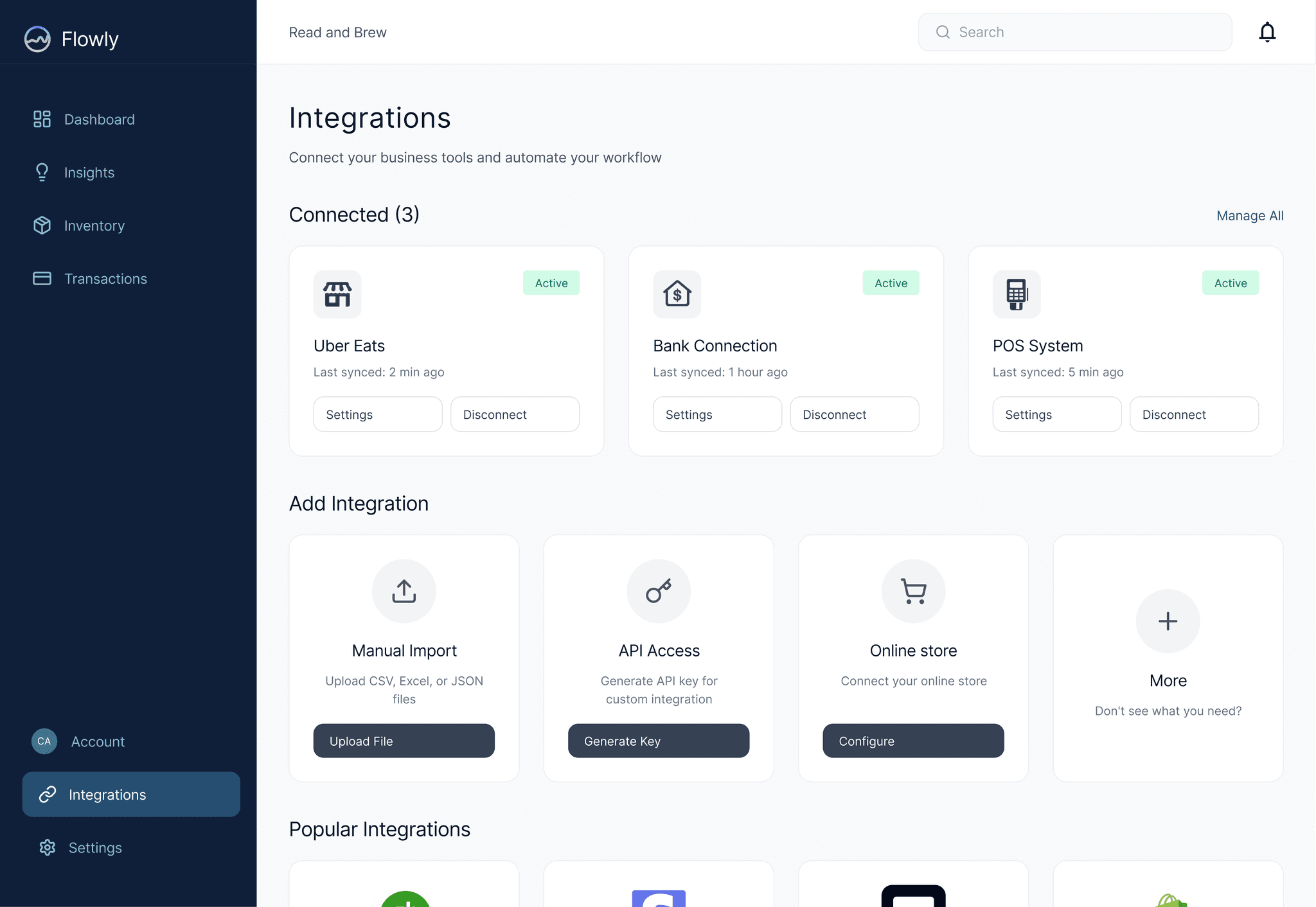
- Problem
- Small business owners make money decisions by guesswork, with their numbers scattered across tills, spreadsheets and banks.
- Approach
- Interviewed four local businesses, co-designed the structure with them, and turned reports into recommendations.
- Outcome
- 100% task completion, under 30 seconds per task, and 4.5/5 satisfaction in testing.
- Role
- Solo product designer
- Timeline
- 5-day sprint
- Team
- Independent
- Tools
- Figma, Figma Make, Procreate
Skills
- Field research
- Information architecture
- Data visualisation
- Usability testing
Phases
- 01Discover
- 02Define
- 03Ideate
- 04Prototype
- 05Test
01 / Problem
Small businesses have big-company money problems and no finance team.
Existing tools like QuickBooks and Xero assume an accountant is in the room.
To find out what owners actually need, I spent the first day in four local shops with very different business models.
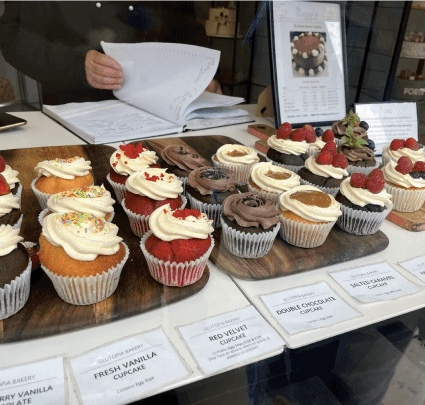

Glutopia · Gluten-free bakery, mostly custom orders
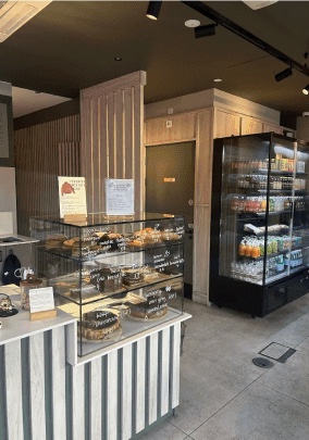
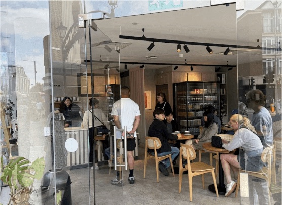
Marna Coffee · Café with in-house bakes & drinks
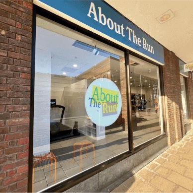
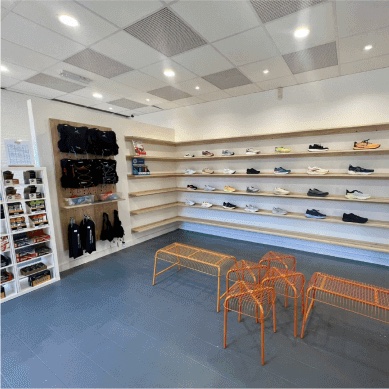
About the Run · Running shoe store with gait analysis
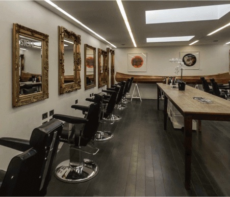
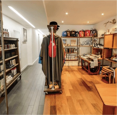
Stone Hair Salon · Hair salon with product sales & stylists
02 / Research
Different businesses, the same three patterns.
Across all four, owners described the same frustrations. Each one shaped a design principle.
- 01
It’s emotional
Owners described stress around cash flow and decisions made on gut feel.
Build confidence, not just charts.
- 02
Data lives in silos
In-store, online and delivery sales are tracked separately.
Unifying sources comes first.
- 03
Numbers don’t say what to do
Even owners who track everything struggle to turn it into decisions.
Interpret, then suggest an action.
03 / Co-design
I took the structure back to the owners, and they reshaped it.
Owners reviewed the proposed structure and told me where it didn’t match how they think. Three of their comments changed the product.
- What owners told me
“Goals and trends feed each other.”
What changedMerged into one Insights section.
- What owners told me
“My till only prints paper receipts.”
What changedManual import became a core feature, not an edge case.
- What owners told me
“What does ‘invoices and transactions’ mean?”
What changedRenamed to plain Transactions.
04 / Wireframes
From pen and paper to a working structure.
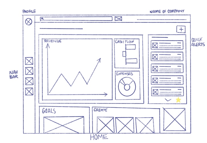
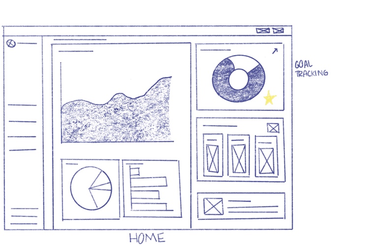
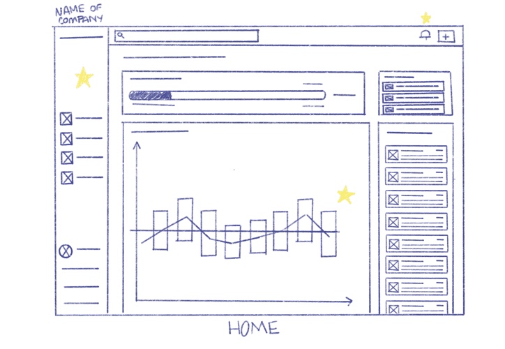
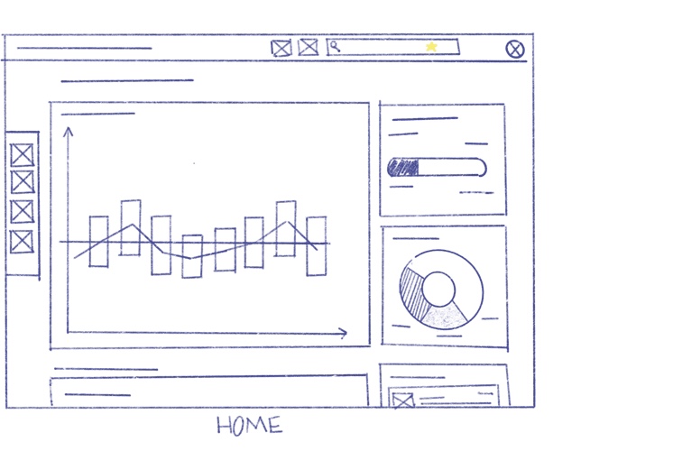
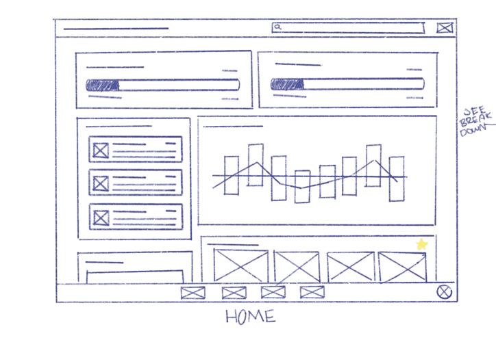
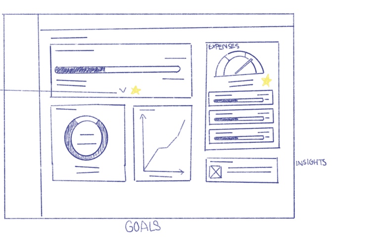
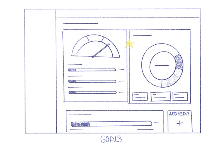
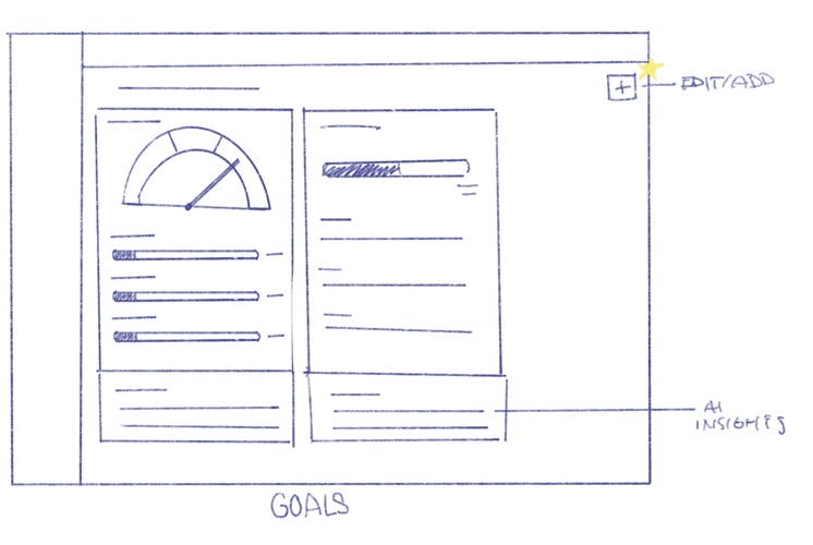
The structure from co-design became sketches first, then grey-scale screens covering every section of the product.
Stage 01
Lo-fi sketches
I explored multiple layouts in lo-fi, focusing on hierarchy, comprehension and glanceability. The goal was to reduce the feeling of being overwhelmed by data while keeping informational depth. Trying different mixes of charts, summaries and insights showed which metrics deserved the most visual prominence. I marked those with yellow stars, to stitch together in mid-fi.
Stage 02
Mid-fi wireframes
The starred ideas came together as grey-scale screens, with real structure, labels and content, before any colour or brand.
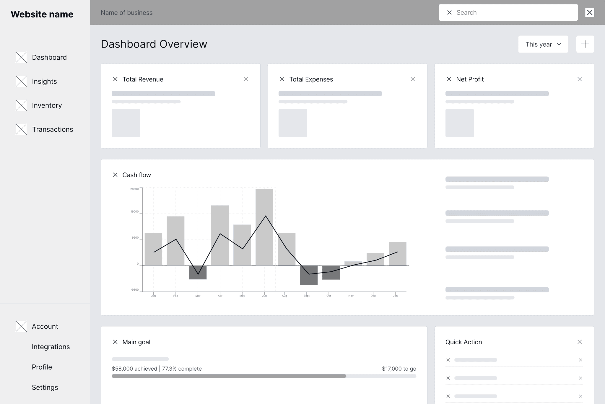
01Dashboard
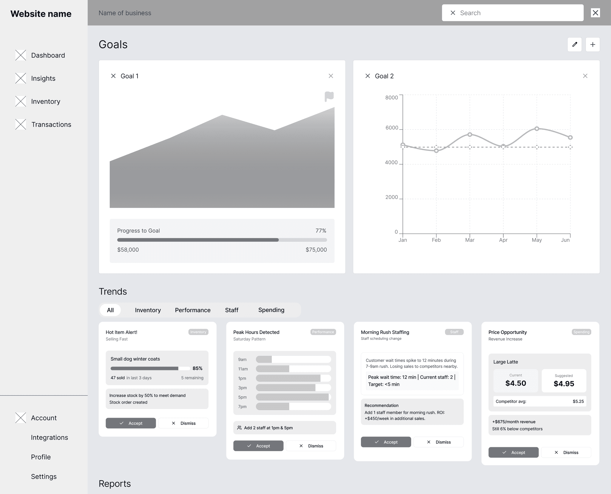
02Goals and trends
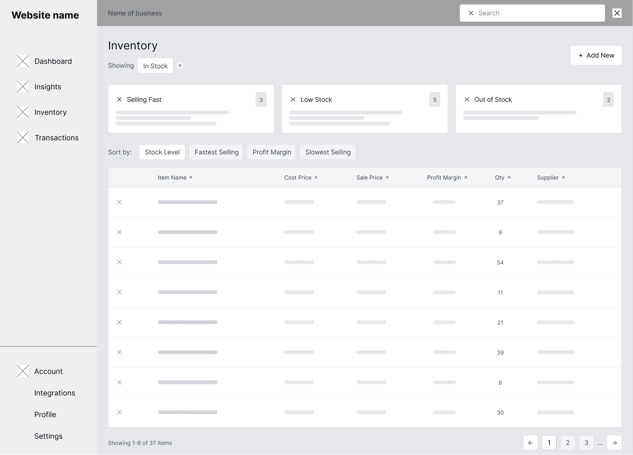
03Inventory
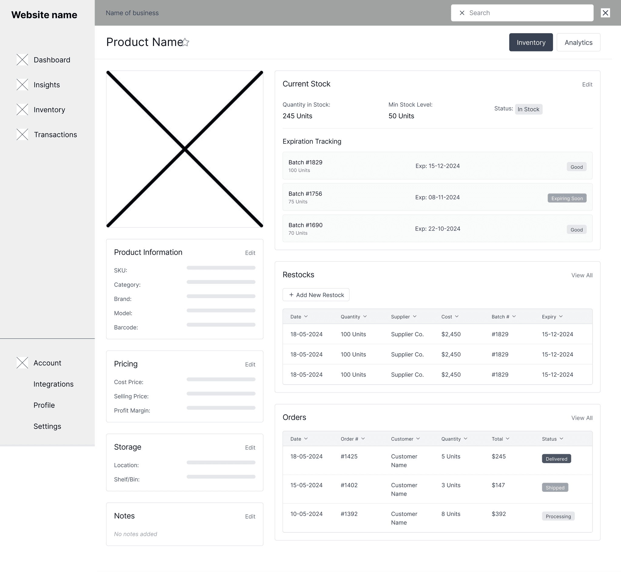
04Product detail
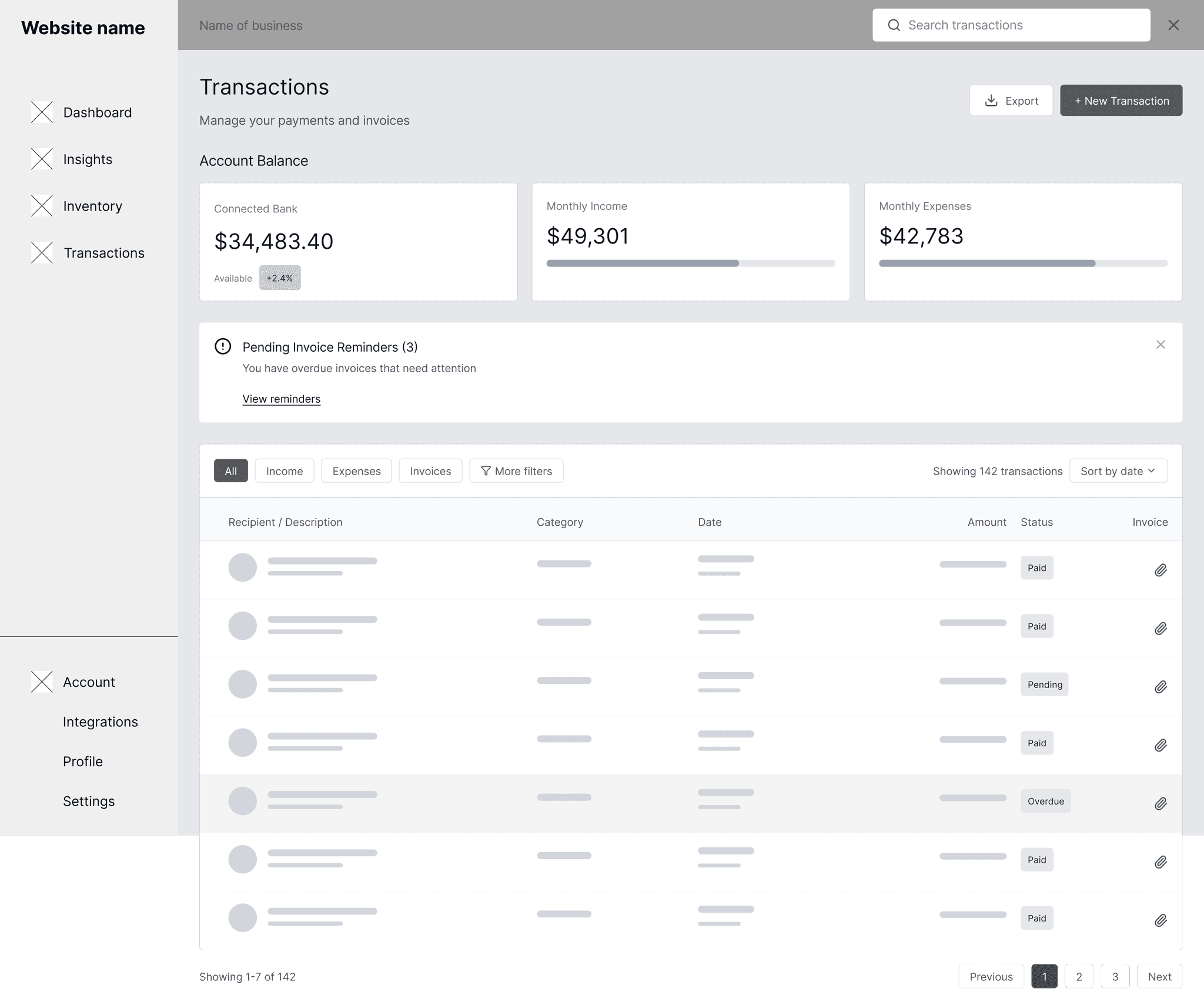
05Transactions
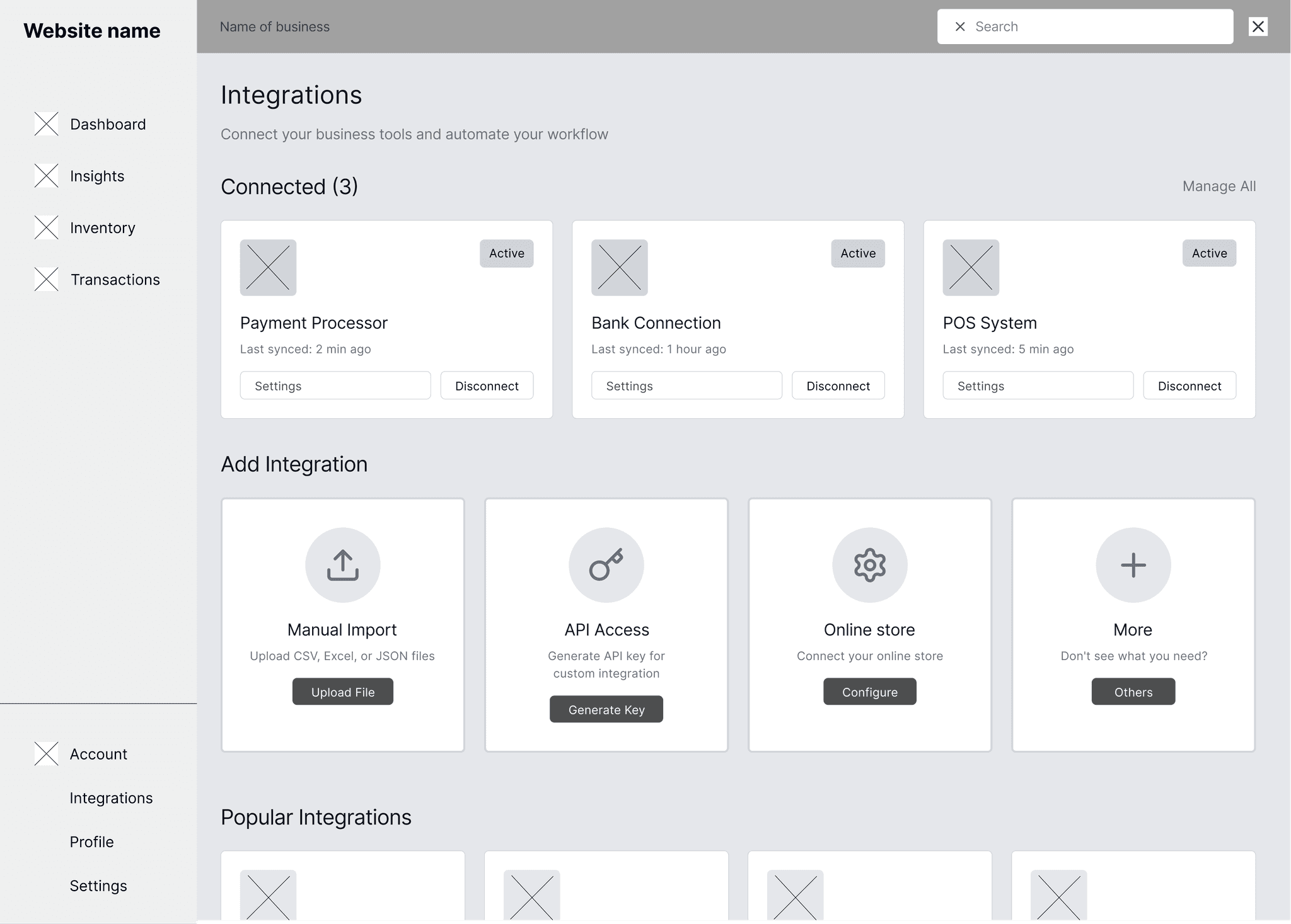
06Integrations
05 / Key decision
From reporting the past to recommending the next step.
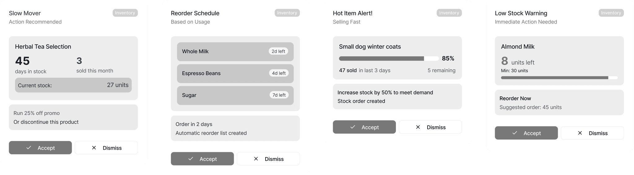
How do we help owners who don’t know what the numbers mean?
Show the charts and leave interpretation to the owner, as competitors do.
Spot a pattern, explain it in plain words, suggest one action.
- Why
- Owners lack financial expertise, not motivation. Cards triggered by rising costs, slow stock or seasonal peaks turn the dashboard into a financial companion.
- Tradeoff
- Automated advice can be wrong. Every card has Accept and Dismiss, so the owner stays in control.
06 / Solution
One calm place to see the business.
The final design gives owners a dashboard they can read at a glance, with the detail one click deeper and a clear next step wherever the numbers need one.
Feature 01
Glanceable by default
Three headline numbers, one cash-flow chart and a plain-language summary. Detail lives one click deeper.
Feature 02
Goals and trends together
Progress towards goals sits above the insight cards that explain how to reach them.
Feature 03
Every data source, including paper
POS, bank and online stores connect in one place, with manual import for businesses that aren’t digital yet.
07 / Details
The small details that build confidence.
01Every headline number shows how it’s moving against last year.
02Goals show progress, with what’s done and what’s left.
03Each connection shows when it last synced and can be changed in one click.
08 / Outcome
Tested with the people most likely to struggle.
Four testers, including people with low financial literacy and reading disabilities, completed three core tasks.
Task 01
Checking stock
Task 02
Connecting a store
Task 03
Finding best sellers
- Task completion
- 100%
- Task completion
- Average time per task
- <30s
- Average time per task
- Satisfaction
- 4.5/5
- Satisfaction
09 / Walkthrough
The whole dashboard, end to end.
The final prototype, starting on the dashboard and moving through the product.
10 / Takeaway
Decide what not to show first.
In data-heavy products, the design work is deciding what not to show first. And edge cases from real users, like a paper-only till, can become core features.
Next: test with owners in their daily routine, and add date-range filters to Insights.
11 / All screens
Every screen in the final design.
01Dashboard
02Insights
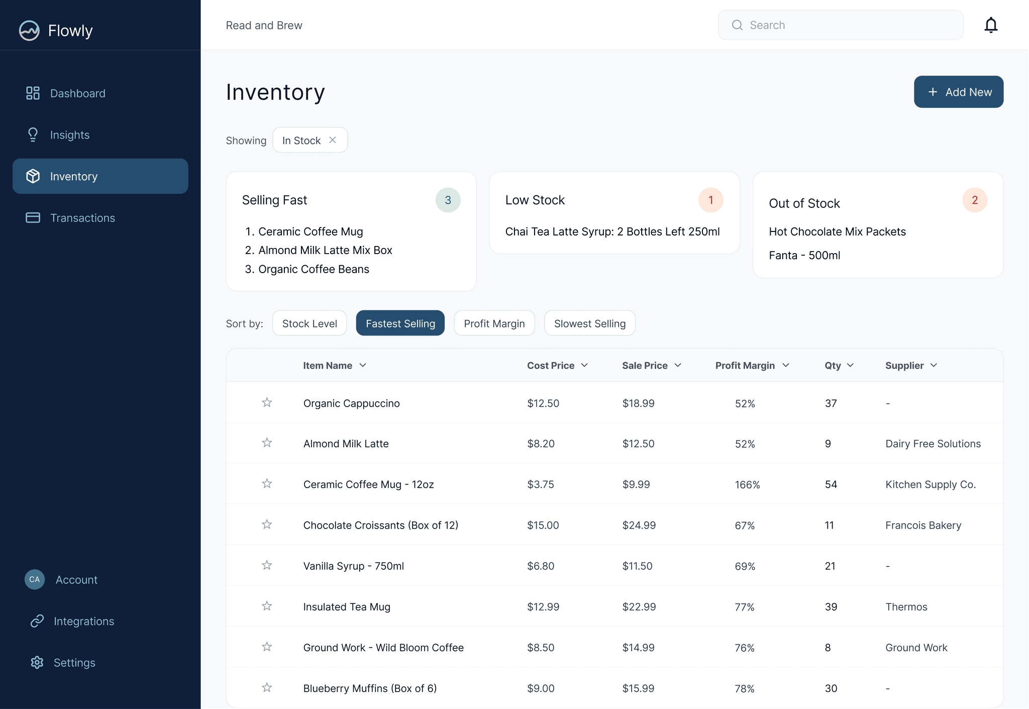
03Inventory
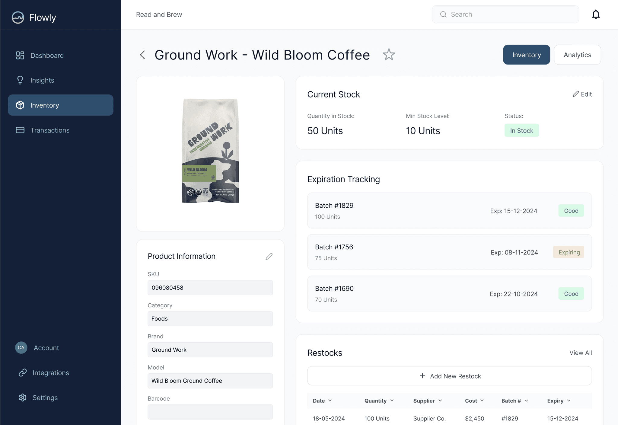
04Product detail
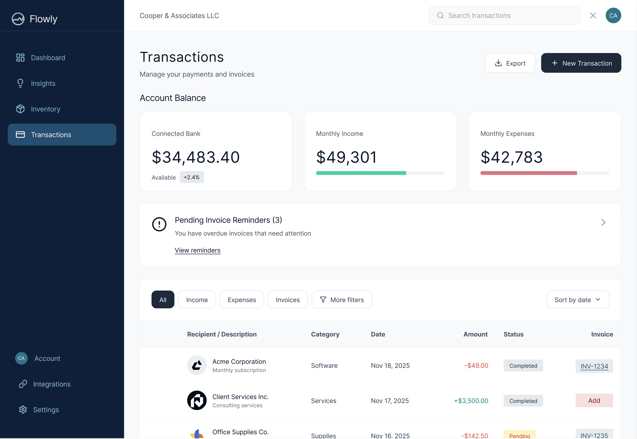
05Transactions
06Integrations